For a website to succeed it can’t solely rely on compelling design and thought-provoking content. Developers need to find a style that feeds into the user experience of the website and functionality while being easy to understand by anyone who visits. These are the very first steps in establishing your business online.
A phrase that often gets thrown around in the world of web design is “beauty is in the eye of the mouse-holder.” Of course, different people are going to prefer different style, but there are a few ground rules you can and should follow when deciding how you want your website to look.
Below you will find five essential design tips that help you head in the right direction and lead to more conversions. These are what digital marketers will suggest to all of their clients.
Minimalist Homepage Design
From your own experience of visiting websites, you will know that people don’t read every word on a website. Usually, we scan websites and pick out keywords and phrases that are of interest to us. Considering these parameters for website viewing, it’s safe to assume it would be better for websites to appeal to emotions rather than aiming for a high word count.
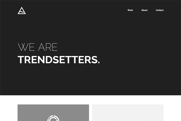
Websites with heavy copy make it more difficult for users to achieve their purpose for visiting. The less they have to read, click or remember, the easier they will be able to process and evaluate the information you’re presenting to them. This makes them more likely to take the action you want them to take and makes text and Calls to Action necessary, as seen on Digital Jumpsuit and Michael Reeves Design. If you break these up with appropriate subheadings and legible paragraphs of copy, as well as using attractive images can communicate your mission effectively.
Visual Hierarchy and Breadcrumbs
The technology we use to view information has come a long way from stone tablets. Smartphones and computers mean that it’s the job of web designers to arrange content in a simple and clear manner. From the moment someone enters your website, you have mere seconds to convince them to stay and take out the actions you want them to.
This is why establishing a clear visual hierarchy to the information, which sets up the breadcrumbs that readers can’t help but unconsciously follow. Apply colour, contrast, size and spacing that accentuates your content while keeping conscious of what you’re drawing attention to and making sure it’s intentionally done. One of the best and most common design elements for creating a strong visual hierarchy on your website are strips, resulting in clear organisation and easily digestible content. A great example of this is the website for South Landing Inn, you can feel your eyes being drawn to particular aspects of the site
Content Readability

The readability of content measures how easily people can recognise words, sentences and phrases. A high website readability means users can efficiently scan your website and take in the information presented in the text without much effort. There are some rules that should be followed to make this easier to achieve:
Contrast is Important
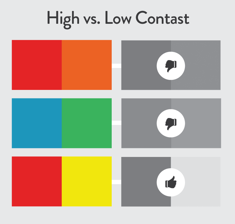
Having the right contrast balance between your website’s text and background makes your text clearer to read. Any good web designer will have carefully chosen colours that are part of the business’ brand identity and they be present across the entirety of your website. It’s okay to play around with different colours but readability should not be sacrificed for creativity.
Small Text is Hard to Read

In the early 2000’s website’s had small fonts, however, developers soon realised that 12pt fonts are difficult to read online. As a typical rule, most websites will now keep their fonts at a minimum of 16pt for body text. This is a great place to start and it should be kept in mind that some fonts are larger than others despite the universal measurement system.
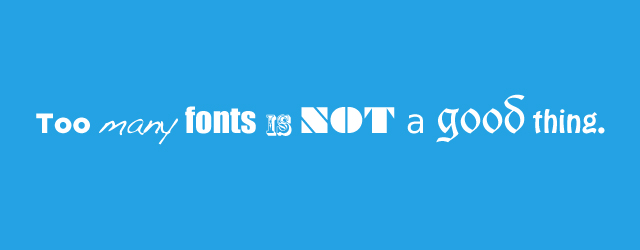
Choose the Right Font

As any designer, whether in web or print, will tell you that your choice of fonts in crucial to the success or failure or a campaign. Different fonts elicit varied reactions from people and tell them what kind of business you are so it is something you should take time to consider. For example – Fonts that look like handwriting might seem fancy but they will force people away from your website.
Limit the Number of Fonts
You shouldn’t for more than three different types of font on your website otherwise it will feel cluttered. Of course, some websites may call for a larger variety, but you must ensure they are harmonious overall and avoid fonts that don’t complement each other.
You can go through a website like DRC Web Design and notice these guidelines being followed.
Easy Navigation
Breaking the mould with a website design may be in your nature but if there’s one aspect that can’t be avant-garde, it’s navigation. Visitors don’t want to they’re wandering through space when navigating your website. Additionally, a solid navigation system will improve search engine indexing of your content while improving the viewer’s experience:
- Link your logo to your homepage.
- Keep your menu at the top and organise by importance.
- Offer vertical navigation that bring users back to the top.
- Add important links to your footer.
- Keep your important content “above-the-fold”
Keep Mobile Friendly
As you will be aware, we live in a mobile-first society as Google has admitted with its new guidelines for how their search engine algorithm indexes websites. It is fair then for you to wonder what your website looks like on mobile and its responsiveness is definitely important to convert customers. Luckily, many themes available for website builders like WordPress are responsive and react to different screen sizes to deliver the optimal experience for your users.
Put yourself in the position of the user, and test out every single page, including the actions and buttons that you want your visitors to take.
Remember to never stop looking for inspiration for your website design and checking out website design tips. It is an essential part of the creative process and it’s important for you to become familiar with what’s possible.
Author bio:
Helen Sayer is a Digital Marketing Executive with several years of experience in marketing and business development. She works for Halifax-based web design and SEO agency, Digital Renovators, and has helped clients from all over the world – including the UK, America, Canada, Australia and Mainland Europe.