Before being aware of web typography techniques for creating a responsive website, let’s just know what exactly responsive website.
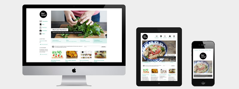
A responsive website is a site that adjusts to any screen size. So, it is simple to use on mobile, tablet and desktop. No pinching or horizontal scrolling needed. Here’s an illustration of a smartphone, tablet, and desktop views of a responsive website:
Responsive Web Design is not only about grids, icons, columns, and images. All of this won’t make sense without text for content. When it comes to content, we have to discuss web typography.
Web typography is a wonderful art of designing and managing various sorts of letters, web fonts and paragraphs used to makes an attractive web design. A typography provides a support to the designer to create sufficient visual hierarchy and visual punctuation. There are different web typography techniques for designing a responsive website. Some of them are mentioned below:
1. Utilize Rem Instead of Pixels And Ems
The utilization of the two pixels and ems is famous. While pixels are fixed, ems are relative units to the parent component. This implies when you resize the program it’s difficult to make sense of it the size you have to set to obtain the output you need to achieve.
A superior choice is utilizing rems. Rems are also called “root em”. It is constantly equivalent to the font size of the root HTML component and what’s all the more energizing with this is it was being supported by modern browsers.
html{
    font-size: 16px; // 1rem = 16px
}

H1{
    font-size: 1.9rem // 19px
}

H2{
    font-size: 1.8rem // 18px
}
In this example, you can see a base font-size of 16px which is the reference of the font-size of the other element. The size of the h1 and h2 will change as the viewport changes. For traditional versions of Internet Explorer, we can determine the font-size in px units first and define the rem units along with it.
html{
font-size: 16px; // 1rem = 16px
}

h1{
font-size: 19px; font-size: 1.9rem;
}

h2{
font-size: 18px; font-size: 1.8rem;
}
2. Pick A Typeface That Works Great In Different Sizes
Users will access your site from devices with diverse screen sizes. The majority of user interfaces need text element of different sizes such as section headers, button copy, field labels and much more. So, it is essential to pick a typeface that works great in various sizes and weights to maintain readability and ease of use in every size.
Most importantly, ensure that typeface you pick is clear on smaller screens. Try to avoid fonts that use cursive script, for example, Vivaldi.
3. Use CSS3 Pseudo-classes To Specify Specific Styles
One of the best highlights of CSS3 is that it can focus on a particular letter, line or passage and give it an alternate style. It allows the designer to resize or adjust the content in various sizes.
4. Focus on Adequate Colour Contrast
Try not to use the same colour for background or text. The more clear the text, the active users are able to read it. So, you need to use following contrast ratio for image text and body text.
Small text must have a contrast ratio of at least 4.5:1 on its background. On the other hand, a large text should have a contrast ratio of at least 3:1 against its background.
After you have made the colour choice, there is need to examine it with the real user on largest devices. In the event that the test displays an issue with reading your text, at that point, you can be assured that your client will have also the same issue.
5. Experiment Rem Units On Different Viewports
Since you know how to utilize rem, you require an experiment on various sizes of screens by via @media queries. The output will rely upon the typeface. Also, you require to utilize certain font sizes and check whether you’ll get the outcome you need.
@media (max-width: 640px) {
    h1 {
        Font-size:1.7rem
    }

    H2{
        font-size: 1.6rem
    }
}

@media (min-width: 480) {
    h1 {
        Font-size:1.9rem
    }

    H2{
        font-size: 1.8rem
    }
}
Now you can see that the little screen the font size is a bit bigger contrasted with the larger screen. This will make a content more readable as users via tablet or phone.
6. Control Your Measure
For responsive website design, the measure isn’t that simple to control particularly on littler viewports. In the event that you can’t control measure, readability of your content is not improved.
Final Words
Making the correct web typography decision can give your website a feel crispness and polish. So, just follow the above-mentioned techniques for creating a good looking responsive website.
Author Bio:

This article is written by Morris Edwards. He is a Web Designer by profession and writer by hobby. He is working at Awebstar, one of the leading Website Design Company in Singapore. He helps in designing web pages for all type of business websites. He is always grinding away on something web design related.