Companies who seek to be successful today increasingly rely on KPIs, or key performance indicators, to help them evaluate the performance and trajectory of their major strategies. Together with benchmarks, a precise combination of KPIs can tell you just about anything with regard to a particular strategy: how it’s working, what specific aspects might be failing or succeeding, and how efficiently the strategy is being executed.
But there’s a problem: KPIs aren’t very intuitive.
Human beings aren’t naturally good at processing or understanding raw data. We’ve evolved to perceive and react to the world based on data we gather and interpret through our senses.
That’s why graphics, stories, and other abstract presentations are usually much easier for us to interpret than raw numbers. So what steps can you take to make KPI reporting more intuitive for your staff as well as prospective clients?
Tips for More Intuitive KPI Reporting
These are some of the best strategies for more KPI reporting that works more effectively.
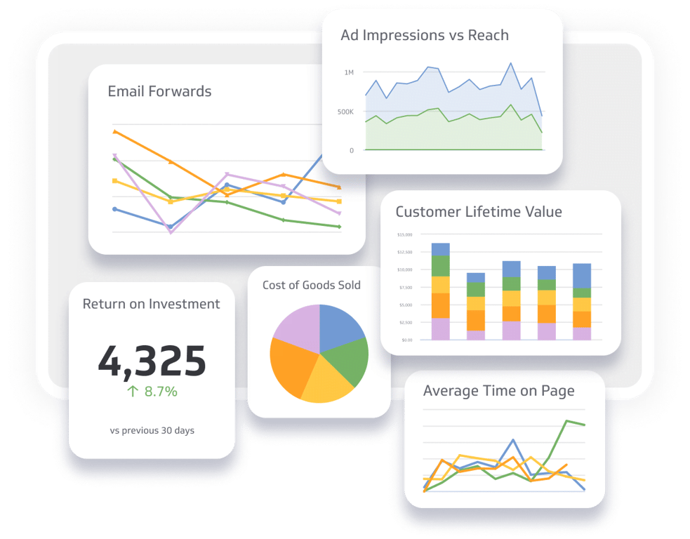
- Build a better dashboard. First, think about building a better dashboard. Most people measure and analyze KPIs using a centralized control panel that collects and presents all the data points that are desired. If you can customize it to show only the most vital information, and show the data points in a way that most people can interpret at a glance, you’ll be in a much better position to arrive at meaningful conclusions in less time.
- Automate reporting. You can also automate reporting. If you create a report template, and use automation to circulate that report on a regular basis, eventually everyone who receives it will become adept at identifying the most meaningful patterns in the data. This takes time, but the result should be impressive consistency in data interpretation and staff understanding.
- Assign clear definitions. Always take the time to define your KPIs and crucial variables related to them. This is critical if you share the information with people who aren’t familiar with data analytics.
- Provide examples. It’s even better to provide examples to the individuals who receive your report. For example, it’s one thing to present your website’s bounce rate and exit rate as percentages; it’s preferable to explain the difference between the two, with clear examples of the visitors behind those statistics.
- Use visuals. Data visualization has technically been around for centuries: the first known statistical graph emerged in 1644. There were probably visual depictions of data even before that. But it’s only been recently that data visualization has advanced to a level that makes it almost universally accessible. Visuals have their problems, though, since they may mask outliers and distort certain variables, but in general they make data analysis more intuitive and accessible.
- Tell a story. You might also create a narrative. People respond to a tale with an arc much better than to mere data points, or even visual graphs and charts. A touch of imagination can instantly make your KPIs more readable and coherent.
- Narrow the scope. People can easily suffer from data overload. If your report is so dense that people have difficulty making sense of your content, try narrowing the scope. For a simple example, instead of reporting on 50 KPIs, present the 5 or 6 KPIs that are most essential.
- Compare apples to apples. When you run reports, always try to compare apples to apples. It’s much more effective to compare a KPI to where it was a month ago than to measure it against a totally different KPI.
- Know your audience. When you present the data, always keep your audience in mind. People who are well versed in data analytics require less than those who have never heard of a KPI before you hit them with your report. You should always be ready to provide extra context and support for the individuals who might need it.
- Collect (and act on) feedback. Mutual feedback makes everyone better. If you wish to achieve more intuitive KPI reporting, ask your audience what they think about your presentation, and whether you can do anything to make it more accessible. If the feedback makes sense, act on it.
KPIs Aren’t Everything
Here’s a final word: KPIs aren’t everything. It’s true that data-driven organizations tend to be more successful than their counterparts who rely on their gut, and if you want to be competitive, data ought to play a central role in your strategy.
However, it’s possible to veer too far into this track and make KPIs your only focus. No matter how sophisticated our analytics become, our approach to data is always going to be imperfect.
In combination with measuring and studying KPIs, you have to broaden the scope of your analysis, engage your creativity, and check the elements that make us human to push your operations further.