Each new year comes with new trends, and the world of web design is no exception. So what’s going on this year? As you may expect, there are plenty of wild and wonderful trends already, even though we’re only at the beginning of 2022.
To be honest, it’s actually fitting that some of this year’s best web designs are so adventurous; after all, we could all use some more of that in our lives! Whether you’re just exploring innovative web designs, or you’re trying to decide which one would work for your website, the options below should offer a little something for everybody. Between eye-catching saturated colors, stark black-and-white designs, and even weird pointer effects, there’s plenty to choose from.
1. Monochrome web designs
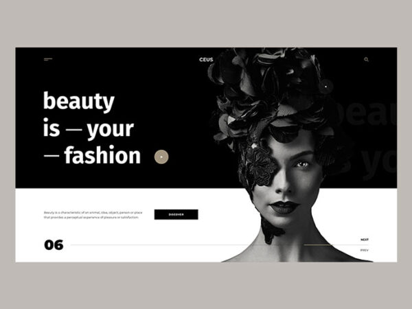
Just because you’re taking colors out of the equation doesn’t mean the designs will be less exciting; in fact, monochrome color schemes can be even more striking than many full-color designs. Plus, you don’t have to stick with 100% black and white in order to get the full effect. Just consider JETA Corporation’s website, for example. Created by website developers at WebCitz, their landing page is almost completely monochrome, but a couple of quick scrolls reveals visual graphics and background images that are in full color – and all the brighter for the initial black-and-white theme.
2. The split-screen look
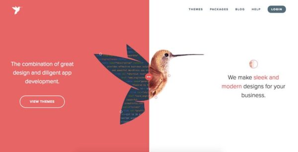
You know how low-rise jeans are making a comeback? Split-screen web pages are having a similar resurgence in popularity. They already had their heyday a while back, mainly due to the fact that they’re very user-friendly. Now they’re getting popular all over again, because they’re very strong visually. You’ll mostly see vertical split screens, but you may come across some horizontal or diagonal split screens as well. And because this type of page makes the site so easy to use, you’ll have no trouble figuring out what to do once you’ve finished admiring the design elements.
3. Experimental typography
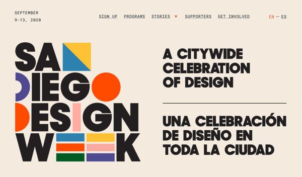
There are so many choices when it comes to typography – and now that it’s 2022, you have permission to use all of them! From elaborate handwriting-esque fonts to basic serifs, there’s a place for everything. Play around with sizing, placement, color, or anything else that strikes your fancy. With the right combination of typographical effects, you could take your web design from good to great. That being said, not all designs will look good on both computers and hand-held devices; the epic titles on your laptop may turn into clumsy trails of letters on a phone.
4. Three-dimensional designs
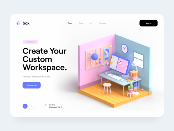
If two dimensions aren’t quite doing it for you, try three dimensions! One option is to make various elements appear as though they’re layered one on top of the other; another option is to use drop-shadows and other effects to make specific parts of an illustration stand out. Whatever you’re going for, a 3-D effect will definitely add to the visual appeal of a website. It may not add to the overall functionality, but it will do something else: increase user engagement. The more people like a website, the longer they’ll spend on it – it’s pretty much that simple.
5. Cheerful, funky designs
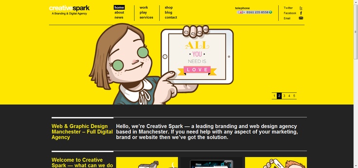
You could find these catchy web designs just about everywhere. It could be a place that sells hand-made sweaters, or an online travel agency. Some designs focus on bright, highly saturated colors, while others use abstract shapes to communicate a unique message. In some instances, the optimism of the design simply stems from the smile of the person whose face graces the page. Whatever the case, chances are it works pretty well; if we know (even if it’s only subconsciously) that a website is making us feel a bit cheerier, we’re a lot more likely to stick around.
6. Scrolling text elements
Nothing says “pay attention to me” quite like a moving design element on the screen. The question is, does it add to the user experience, or distract from the main point of the page? When a scrolling text element is done right, it adds to the entertainment factor as well as communicating the brand message. The main thing to remember is that you have to keep it short and sweet. If you make the text too long, it’ll be hard to follow and the last half will just get ignored. Make it too complicated, and the same thing will happen. Instead, stick with a few words and use big letters – it’s much easier to absorb (and enjoy) that way.
7. Oversized pointers
You know what aspect of web design almost always gets ignored? You guessed it – the pointer. Some websites are catching onto its potential, though, and are having plenty of fun with it too. Not only could your pointer be extra large on some of these sites, but you might notice it changing shape or color when it passes over a clickable element. With a “new” pointer to use while you’re on the site, it can even feel more immersive than the average user experience. It may not be the most game-changing web design trend ever, but it sure is entertaining!
8. Pages without pictures
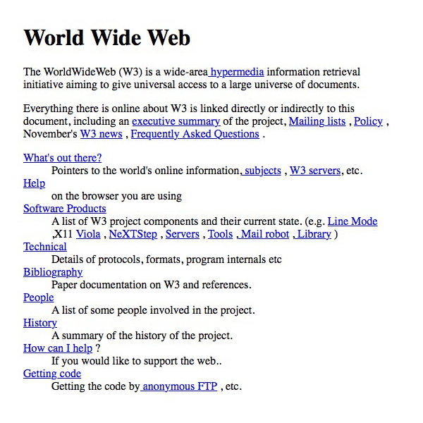
This might sound counterintuitive; why would you remove the most visually stimulating part of the page? Well, if you don’t have pictures, you can do all kinds of fun stuff with the text. Blow it up to sizes you never thought were possible, or use it on a stark white background for an iconic minimalist look. As a matter of fact, some websites manage to look totally put-together with nothing but basic typeface on a blank background. It’s all about the aesthetic.
Which one is your favorite?
There are all kinds of ways to spice up a site’s web design, even if you’re just adding a few elements to what you already have. The question is, which designs have staying power, and which ones will be novelties that are only observed in a few sites? Only time will tell. And in the meantime, we can have fun watching what happens!
