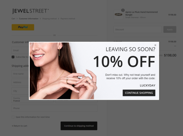
Lightboxes are special popups that cover the whole page, which is often used for website page promotion, enabling users to sign up for newsletters or inform about sales. Some websites use lightboxes to promote their offer and showcase their products.
This can be done in any case when you want your customer to see a popup window before they leave your webpage. For example, it may be beneficial if you have an eCommerce website, so it will be easier to persuade a visitor to buy something after the first impression. Another case is when you have a blog with a huge readership, and you want their return in order of once per month and purchase something new at each visit. This guide will explore a website lightbox and how to create one without fuss.
How Can You Use Lightboxes?
Lightboxes are widely used in eCommerce websites and blogs as a promotional tool. They can also be used as a call-to-action tool. You may also use a lightbox to turn your blog into a call-to-action tool for your audience. This is especially useful for bloggers who need to build their audience before launching a paid product or service.
Page Promotion
A lightbox provides a great opportunity to get in touch with users and convince them to visit your site more often. You can do that by promoting a post or a special offer. Of course, it is possible only if you manage to implement a lightbox in web design.
Enabling Users To Register Or Sign Up For Its Newsletter
You can use the lightbox to increase your mailing list size. This is an effective method, especially if you plan on launching an eCommerce website soon or already have one and want to increase sales via email marketing. You can provide users with an opportunity to sign up for your newsletter or newsletter service. You can do this by using a lightbox.
Inform The Audience About Sales And Promotions
You can also use lightboxes as a promotional tool, which is especially helpful if you have an eCommerce website or blog. As such, before running a sale, it will be good to inform your audience about this new product or offer and get feedback from users in order to make an alternative decision.
Note The Cookies This Or That Platform Uses
If you have a digital product, you can place a cookie with information about the user’s order on that platform. You can also place some text with the customer’s info on your website and offer it to the customer who wishes to purchase your product again.
How To Create Flawless Lightboxes
As you already know, lightboxes are very popular in eCommerce and blogging platforms. That said, it is time to explore the most effective ways of creating a lightbox in web design.
Your Popup Messages Have To Be Simple And Attractive
It is important that your message be simple and easy to read so that users read it without any problems. Remember that popups can be annoying, especially if they have too many words on them or if they do not use enough white space or line spacing.
Choose The Right Tone
The next thing you need to do is to choose the right tone. This will depend on the content of your popup. If you are a business, it will be most beneficial if you use a light tone, which is not too cheerful but optimistic. However, if you are a blogger or an eCommerce store owner, it would be better to use a more positive tone to convince the visitor of their purchasing decision.
Select Influential Call-To-Action Phrases
Once you have designed the popup, you should consider which words to use as call-to-action. Your choice can depend on your audience, product, and business type. For example, if you have an eCommerce website and are selling a particular product with many benefits and discounts, the call-to-action message could be “Buy Now” or “Get $50 Off Right Now”. This will make it easier for users to understand what they are getting into when they click on it.
Your Lightboxes Have To Be Tuned With Your Branding Style
The next thing to do is to make sure that your lightbox design is well-aligned with your brand’s identity. For example, if you have a website for a furniture business, you should select the colors for your lightbox that are close to the colors used in your website. In addition, make sure that the font is similar to the one used on your site and not too crowded or small.
The Bottom Line
Lightboxes are powerful tools that make it easier to promote your website, so you need to adopt this method in some form or another in order to expand your brand and gain new users. Remember that you can use lightboxes only if you have a good idea of what they are and how they work.


