Portraiture has exploded, inadvertently perhaps, in recent times with the advent of social media apps and the response from smartphone manufacturers who built the front-facing camera. With the rise and rise of social media, the selfie has become the go-to photograph to document our lives whether it’s out and about with friends or at home alone to send to our friends. And while the selfie may not quite be portraiture in the traditional sense, it is certainly some form of it. In this list we’ll be looking at some tips and tricks to improve your portrait-taking which invariably also applies to taking selfies too.
1. Lighting
Always the most important aspect of photography: lighting.This obviously affects the photo massively in terms of mood, style and clarity among other things. The influence of light is unavoidable and is the first thing to take into consideration when composing a portrait. Using natural light can be perfect for capturing vivid detail if you have a sunny day for instance but then you also run the risk of capturing harsh and unwanted shadows. Natural light is great for certain styles of portraiture as it lends itself to a more genuine feeling and likeness of the subject as we’re seeing them as they are in the street or wherever the scene may be.
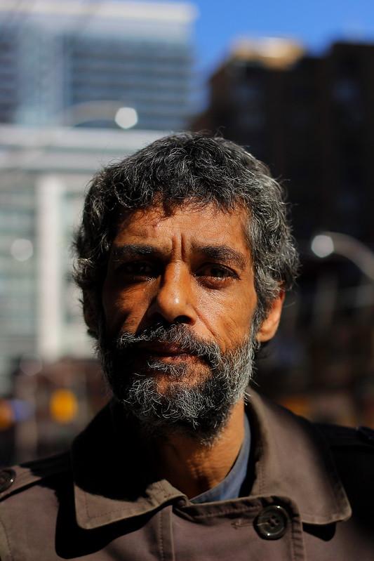
Photo by Uteropo
The above image is a great example of shooting in natural light and how shadows add an air of mystery or simply obfuscates the overall image depending on who you ask! To get around this problem, artificial lights or reflectors are used to get an even coverage of light across the subject. Having more control over the lighting is a great tool to achieve the look you want where the natural sunlight may be too harsh – of course this may be the look you desire! Experimenting with all available options is always the best remedy to find the image you’re looking for.
2. Composition
Another important element that can add so much, or have the opposite effect, to portraits is the composition of the photo. With a portrait you may think that the composition is merely a headshot but there is plenty of room for exploration within the format. Even the profile doesn’t necessarily have to be front-facing although this is the norm. Trying different angles toward the light, away from the light will all have significant impact upon the final image. You can already see how selfies on social media have developed, as a common and popular style now is to hold the camera up high and pointing down. This also creates distortions in body proportions as a lot of the front-facing wide-angle lenses will elongate the body while the head looms largest in the frame.
The beauty of a portrait is that the interest and attention is always drawn to the face, so as long as you don’t create too much distraction in the frame the face can do much of the heavy-lifting in terms of carrying the portrait.
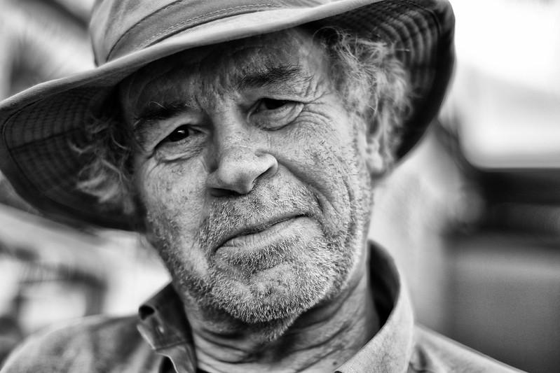
Photo by ibreem
The above photo illustrates this point well as it’s a simple black and white portrait with the face taking up the majority of the frame but it’s exactly because of the character behind the face that the photo is so effective. This is a more classic example of what effective portraiture is, and it’s the transfer of a feeling through the lens. In my personal opinion, great portraits are taken, if possible, when the subject is unaware or not thinking about the camera because you want to capture emotion as it’s presented naturally on a face.
3. Details
When taking portraits it’s really worth making extra sure that what you want as the subject is in clear detail. Using the above photo as an example you can see that with such a shallow depth of field that even as close as the back of the hat becomes blurry. It’s really important to properly focus on the part you want to be clearly visible, usually the majority of the face. As always there are exceptions and you can play with extreme close ups and having only certain facial features in focus but as a general rule it’s good to emphasize the face and blur the background.
Using the eyes as a focal point is generally a good rule to follow as they’re not only where the audience is drawn to but also should mean that the rest of the face is in focus too. The above image is a good example of this as the whole face is in focus but as you go a few centimeters back to the ears, hair and hat you can already see that the plane of focus has dropped off. Again, it’s worth experimenting with the depth of field and see how much you want in clear detail.
4. What’s in the Frame
As I mentioned earlier, there’s plenty of room for play and experimentation when it comes to portrait shooting. Usually you don’t want to add too much as the face is always going to be the main attraction but it’s worth trying out props or certain things to frame the face. Taking the shot through a natural aperture; window, door frame or whatever else you find that can give the photo a unique perspective.
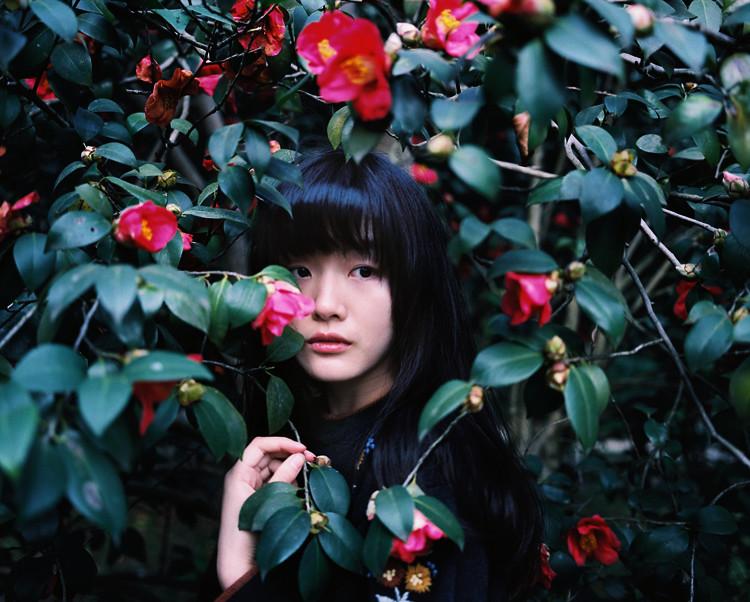
Photo by Itsuki Arashi
The above photograph is the perfect example of creatively framing the face. We also get the hand in focus which I think is another pleasing visual element along with the pops of colour throughout the frame. You can also add props to the face: liquid splashing always creates a spectacle – there are so many options available.
5. Rule of Thirds
This is rather a suggestion than anything else as it’s another tool to play and experiment with. The rule of thirds basically divides the frame up into 9 equal parts as you can see in the example below. By having visual interest fall along where the lines cross, this is apparently where your mind naturally goes to when viewing an image. There are plenty of examples that support this rule but it doesn’t need to be followed to a T; there are also plenty of examples that work just as well that don’t adhere to this rule.
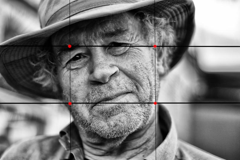
Photo by ibreem
Again, this is another application in a photographer’s toolkit to trial and error as you take photos. See what works and what doesn’t – this is ultimately how to improve (as with anything!).
Hopefully these tips and suggestions have served to give you some ideas to try for any future portraits. Practise makes perfect and this is certainly true for photography as the more you practise the better feeling you’ll get for capturing the right shot.
Author Bio
Andrew Farron works for Fable Studios, a Creative-led boutique video and animation studio that creates tailored brand stories that endure in your audience’s mind. Fable combines your objectives with audience insights and inspired ideas to create unforgettable productions that tell the unique story of your brand.
Cover Photo by Christian Wiediger on Unsplash
