Do you own a website? If you are a business, it is high time you create your own site.
According to Impact, over 81 percent of customers first search online for a product before visiting the store physically. This holds true regardless of which sector you operate in. For instance, according to Statista, 29 percent of Gen Z customers have shopped for groceries online as well!

Merely having a website is no longer enough. You need to make sure that your website serves as a visual treat when it comes to its design.
Why?
Because web design matters immensely!
As per Web FX, 75 percent of business credibility comes from the design of its website, while 57 percent of internet users won’t recommend a brand to others if its website is not up to par.
Nowadays, to create the ultimate website experience, you must work to make it responsive.

This is because over 63 percent of visits on Google alone come from mobile. If you don’t make your website responsive, it won’t reflect well on different phones and hence will lead to a high bounce rate.
Here are essential tips you can use when creating a responsive website that customers love.
1. Alter your site navigation
Remember, small screen navigation is significantly different than those of desktop. In a desktop version of the website, generally, all tabs are present on the top horizontally. However, if you do so on a mobile site, it won’t be responsive.
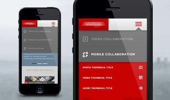
So, the first thing you need to do is to pay attention to the navigation requirements. Simplify your navigation as much as possible. Use icons with text for easy understandability along with collapsible menus and drop-downs.
This will help in utilizing the restricted space without making the site full of too much information. But, make sure that you keep all the core categories discoverable.
For instance, while tabs like About Us, Blog, and Portfolio can be hidden, Services, Shop Now and Contact Now are categories that should always be visible to the customers.
Similarly, make sure that the logo and name of your site are visible as well. This allows businesses to conduct effective branding throughout the customer experience of using the site.
Such branding efforts help increase brand recognition and recall. While you are at it, make sure to have a professional logo design.
2. Design for multiple dimensions
One of the biggest challenges you will face when creating a responsive website is deciding what sizes to design for.
After all, there are hundreds of different smartphones and tablets out there, and their dimensions vary.
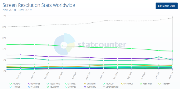
Source
To find out which dimensions and page sizes are most popular for your site, you can make use of Google Analytics. But, what if the insights share a long list of devices with you? How will you then create a responsive site for them all?
A great starting point is to set an achievable goal when it comes to dimensions. Rather than trying to make your website responsive for all dimensions, start with the top three layouts. Here are three dimensions that might help:
- Under 600px: For small phones
- Between 600 to 900 px: For tablets and large phones
- Above 900 px: For personal computers
Make sure that despite the changes in layout, the same content and graphical elements are reflected in them all. What you must change is the display of content. For instance, for small phones, you might have to scale the written material relative to one another to make it more readable.
3. Consider the challenges of touchscreens
Gone are the days when phones had buttons. Now, most smartphones operate via touchscreens. And sometimes, this is a massive reason for misclicks. You might have heard many people exclaim that their fingers are too small for the buttons of a website!
This is something you should always avoid, especially when it comes to your call to action buttons.
Your call to action buttons shouldn’t just stand out in terms of color and style, but they should also be large enough to be easily clicked.
Don’t get too creative with its shape. Keep it as familiar to any other button on a touchpad to ensure that customers understand that it is a button, to begin with.
Keep the size finger-friendly. To do so, the recommended height is 48dp.
Moreover, make sure that different buttons and the text links have enough space around them to prevent misclicks. The same philosophy goes for two side by side buttons.
4. Plan your content structure prior to designing
Many people make the mistake of designing a website before creating its content structure. You cannot create a compelling and responsive website unless you know what items need responsiveness in the first place!
So, you must first plan your content structure. Decide how you want to organize your content and then create a design that is in-sync with your vision.
![51 Insane Web Design Statistics 2018 [UPDATED] | Web design ...](https://technofaq.org/wp-content/uploads/2020/05/51-insane-web-design-statistics-2018-updated-or-w-600x229.png)
Don’t think of your content as blocks of text containing relevant information. Instead, think of it as a story you are telling your customer. Your brand story is what will attract people to complete their purchase.
Each element of your content should be a continuation of the previous one. So, list down the messages you want to convey and find ways to make these messages flow out of one another.
Once you have your content structure set, you will find it easier to design the perfect navigation.
Also, remember that the content organization doesn’t mean creating verbose texts. A lot can be told while using few words. And this is a theory you must adopt when working with mobiles and tablets. This is because while desktops might allow for more text, mobile devices don’t.
5. Align your typography with the screen sizes
You need to scale your font size, line-width, and height to a dimension that best fits with various screen sizes.
The goal of aligning fonts with screen size is to ensure readability. There is no clear cut answer to what font size you should opt for. Just make sure that when designing your website, it is not hard to read.
Additionally, the typography you choose is also essential. Select a legible font, especially for the crucial categories.
Don’t leave too much space between text. Adjust your line-height to a value that doesn’t make it seem that your text is floating in mid-air. At the same time, don’t make it so less that the words seem to be stacked up together and hence are hard to read!
To make sure you don’t make typography related mistakes, it is recommended that you keep checking your text on dimensions of various different devices. See how the line height and width are being reflected and decide if you want to make any changes.
Verdict
With these five tips, you can easily create a responsive website that works seamlessly on various devices. Once you have optimized your site for the mobile experience, remember that there many other things to take care of.
Your website aesthetics and functionality will ensure that customers stay. But, your product offering and content will seal the deal. So, work on it all. When you add SEO to the mix, together, you will be able to create a website for your business that ensures conversions.