
Designing an app is an innovative and exciting process. There are currently 8.7 million people worldwide developing apps, a process which requires both creativity and technical expertise. However, while designing an app is rewarding, it can also be nerve-wracking. With constant development changes and new technologies being presented, it’s easy to run into pitfalls while creating your app.
To help make the development process smoother, this article is going to discuss the top eight mistakes to watch out for.
Your app doesn’t fill a real need
Creating your own app is interesting and hip, but you shouldn’t create an app simply because it’s a cool thing to do. Many apps fail simply because they don’t fill a user need. Before you begin working on your app, talk to potential users. See if they really do have a problem your app could solve. Ask yourself if your app is the best way to solve that problem. It’s better to do nothing than to create something useless.
You don’t prototype with users
When designing an app, you should always have the user in mind. Begin with rough prototypes, like paper sketches, that the users can interact with. Observe how they reason their way through the app. Is there a way you could make the flow of information and pages more intuitive? Is there anything that’s confusing them or that is unnecessary? Make sure to ask them what they’d like to see change. Repeat this process again and again as you develop more complete prototypes. You want to ensure that your final product is exactly what they want.
Your UI is too cluttered
If your app has too many buttons and images on every page, it’s going to distract and annoy the user. Aim for a sleek design that’s intuitive and clear. There shouldn’t be a learning curve on your app. Users should immediately understand how to navigate your UI.
Your app requires a lot of user effort
If your app requires a lot of user input such as forms right off the bat, users are likely to get annoyed and jump ship. They expect your app to serve their needs, not the other way around. Try using autofill forms and forms that remember user info. Cut back on the amount of information you ask the user for whenever possible.
Your app uses hard-to-click buttons
Think critically about where you place buttons on your app. There’s a range across the phone screen where users can press buttons without straining their fingers. It stretches from the right bottom corner and curves up to the center-left. This diagram by Scott Hurff shows the comfort clicking zone for a right-handed person:
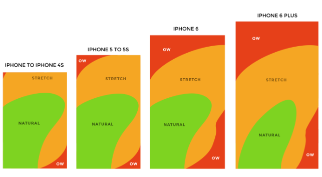
Make sure that your button falls somewhere in this range. Your users don’t want to stretch their fingers at an awkward angle to move through your app. Button placement is especially important to keep in mind now that borderless phone design is more common. Designers need to understand how users naturally interact with their mobile device and adapt their design for that.
Your app uses jargon
If you’re tempted to use big words in your app, think twice! Sometimes simplicity pays. Use language that is intuitive and accessible. Avoid difficult words and technical terms, and focus on clear, direct language.
Your app asks for permissions without context
If your app needs to ask a user for permissions, only do so in context. For example, if your app needs to access a user’s photos, wait to ask until the user is beginning the relevant action. Imagine you have a social media app. You should wait to ask for the user’s photos and camera access until the user is actively trying to post something onto the platform. If you do this out of context, they might be suspicious or annoyed. If the user understands why you need the permissions, they are more likely to comply.
Your app isn’t personalized
Users crave a personalized experience that is specialized for their needs. Design your app so that it adapts to each user. You can do this by using a user’s past data, whether that be login info, past purchases, or preferences, to customize their later experience. You can also use location data to give them information relevant to their current physical location.
By avoiding these eight common mistakes, you escape the failures of other apps. Solving user-centric problems, prototyping with users, and constantly keeping your user’s needs in mind, you are on track to triumph. Whether that means cutting back on jargon or decluttering your UI, your customers will appreciate your efforts.