Web design is taking on a greater level of importance and those who are looking to make a name for themselves in this realm will need to consider certain facts. For starters, the average browser is now far more likely to pull up web pages on their smartphone (as opposed to their desktop computer).
This creates a climate where mobile friendly web design becomes even more crucial. Those who do not take the time to consider the ins and outs of mobile friendly web design are placing themselves in a position that is less than advantageous.
Fret no more! We are here to provide a very helpful guide to this process that will allow site developers to sidestep the usual concerns that take place. All websites that can be viewed on a mobile device are not exactly mobile friendly. Thanks to these pointers, this is no longer a problem that you are going to have to deal with.
Prioritize Responsiveness
There are few things that will turn someone away from your site faster than a lack of responsiveness. When it is in the process of being designed, you need to make sure that you are prioritizing the correct technology. It is all about the framework and there are a variety of responsive frameworks to choose from. These frameworks are easily established and any design firm can stand to learn as much as possible about how they work.
Consider The Browser’s Hand Position
Think of it this way: the average browser is not going to be hunkered down over their phone, using both hands in order to check out the site that has been built. The developer needs to consider the position of the browser’s hands before they place themselves in a difficult position. As a rule of thumb (and the pun is certainly intended), the site should be navigable with just this digit. If the user has to do any pinching to navigate, this is going to put a damper on your level of success.
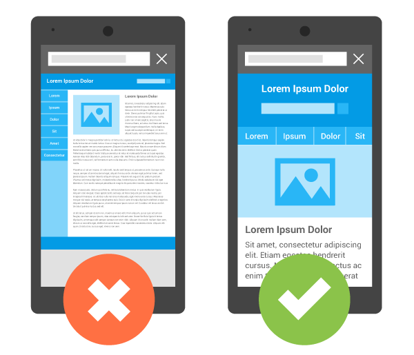
Don’t Get Too Cute
This is not the time to become a showoff. Simplicity is key and the user should never be confused by what is taking place. Place yourself in their shoes when you are in the process of designing a mobile friendly website. Is the design clean and focused or are there a bunch of unnecessary bells and whistles that are getting in the way of the browsing experience? This is a question that needs to be answered honestly before you can proceed.
Use Icons When Possible
As the old saying goes, a picture is always going to say a thousand words. If you are struggling to create space when you are creating a mobile friendly website, it is important to take a closer look at the icons that you are relying upon. When users are able to tap symbols that are easy to recognize, this goes a long way towards creating a far more enjoyable browsing experience. Use icons like these as often as necessary.
Don’t Neglect The Importance of Geolocation
This is one of the best mobile capabilities to consider when you are in the process of designing a site. Businesses are able to benefit from this feature immensely. It allows them to speak to their target audience more directly. They can provide directions to their potential customers and visitors can also also check specific locations to find out about the availability of certain items. A company that wishes to offer targeted promotions is going to benefit as well.
Avoid Heavy Media Files
As a friendly reminder, we feel compelled to let you know that the heavier media files that may have been usable on your desktop site will probably not work as well on the mobile version. If your site relies on large pictures that take a sizable amount of time to load, this is something that you need to consider. In most instances, the browsers that are going to be used on a mobile device will be much slower than the browsers that are used for desktops.
Considering All Platforms, Operating Systems and Devices
One of the more common mistakes that is made during these types of instances is a refusal to consider the benefits of all platforms, operating systems and devices. Too many mobile web developers fall into the trap of only considering one specific platform and allowing all of their efforts to be focused on this area specifically. In reality, developers should be taking the time to contemplate the pros and cons of all platforms, devices and operating systems.
Provide Contact Info
Let’s say that a business is looking to create a website that will drive more conversions. In order to do that, they will need a site that is responsive and easy to use. From there, they must also make sure that they are providing their contact information in a manner that is easily seen. If the browser cannot find the information that they need quickly, they are likelhttps://developers.google.com/search/mobile-sites/imgs/mobile-seo/viewport.pngy to move to a different site as a result of that inconvenience.
Be Smart With Your Video Choices
It is no secret that the modern consumer is more likely to be enticed when they are given access to awesome videos. However, it is important for mobile site developers to consider the pros and cons of this approach. The video needs to get the job done quickly and it cannot impede the user’s browsing experience in any possible way. Video is a must have but it cannot keep the user from enjoying a flawless experience.
Keep Form Fields In Check
Anyone who has ever had the misfortune of pulling a website on their smartphone that was not correctly optimized for the experience can relate to this one. The form fields that the browser will be filling out need to be designed in the appropriate manner. Asking people to enter all of their information into form fields that are not correctly formatted is a very difficult pill to swallow.
Author Bio:
Harnil Oza is a CEO of Hyperlink InfoSystem, one of the leading app development companies in New York, USA and India having a team of best app developers who deliver best mobile solutions mainly on Android and iOS platform. He regularly contributes his knowledge on the leading blogging sites.