Mobile platforms are in the central focus of website design in upcoming 2018 year. According to statistics, smartphones and tablets became leaders in the number of impressions even in 2016 year. So, companies and developers are more and more geared to make mobile web usage more convenient and simple.
1. Technicolor and bright graphics. Gradients are used more than ever
Color is very important for the perception of a website, computer application and brand. It stirs emotions, and can spark your target audience’ interest.
We will have to leave delicate and dimmed colors of interfaces behind in 2017. The most trendy colors in the upcoming year will be:
- Red
- Pink
- Purple
- Deep purple
- Indigo
- Blue
- Light blue
- Cyan
- Teal
- Lime
- Amber
Eye-catching, bright colors will add zest to the feelings. Moreover, if you make good use of these colors, they will make your text more readable. Also, using bright colors for interface creates a sensation of vibrant energy flow.
2. Adaptation of the alternative reality into your products more than ever
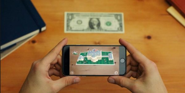
The success of Pokemon Go and Snapchat is only the beginning of new age in creation of mobile application design.
Many of us are aware of such notions as alternative and virtual reality. However, this sphere is new enough in the world of mobile applications design. There should also be a lot of skills and creativity to work in this sphere. The areas where VR is used include:
- Construction activities; architecture; engineering.
- Education: model design for illustration purposes.
- Health Care: the technology of alternative reality is already used in electronic systems of surgical practice to improve treatment modes and diagnostic techniques. It is also used to discover new treatment models and diagnostic methods. By virtue of the system, Augmented Reality scientists can broadcast live event online during the surgeries, have consultations, hold forums with their colleagues, teach intended doctors.
- Trading and Marketing: Augmented Reality redound to companies that deal with online sales, to reduce distance between customers and traded commodity, allowing to purchase using both paper and digital catalogues in leisure centres or subways. This allows users to buy without visiting a shop or even a website.
During the last year, the quantity of downloads of applications that use augmented reality technology increased. The implementation area of these applications was also extended. In 2017, this innovation moved beyond the sphere of entertainment and games.
However, nowadays it is clear, that 2018 will be the year of augmented reality. More and more people will use their smartphones and tablet computers as portals to the online world.
3. Cinemagraphs, GIFs. More micro-animations, more emotional animations
“Active photos” – cinemagraphs and short videos – GIFs stand proudly among trends in 2018. Device performance and device functionality are the first key, so developers will not create cinemagraphs just for laugh. They will rather be used to draw attention to important aspects on a page.
People are programmed to notice motion, so using animation is a great way to draw audience’ attention to some products. This issue makes animation an irreplaceable tool for the e-commerce.
Micro-animations, that are animated parts of mobile application’s interface, can greatly brisk the styling and improve user interaction.
In 2018, we will see more emotional intelligence integrated into mobile UX. EL will not involve only animation which appears after user performs some activities. Face recognition technology will be used to provide more live reactions.
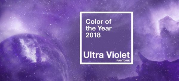
4. Colors approved by Pantone Color Institute. This year, the trendiest color is ultraviolet
According to the Pantone Color Institute, predominant color of the upcoming year will be ultraviolet. To get the most accurate result, the professionals made a research. This study involved all the world’s fashion and design tendencies. The direct speech of the company chief operating officer goes: “Ultraviolet is the mix of delicate blue and bright red gradations, this color perfectly represents current situation in our world. This is not only a hue, but also a symbol that promises changes for the better”. This trend has already been picked up in the world of fashion. Global brands as Chanel, Gucci, Fendi use ultraviolet for their new collections.
5. Artificial intelligence technology infusion used more than ever
Customizable commerce, and online customer support available 24/7 is flourishing feature for any business.
Applications more and more often inquire users’ preferences; this is not just a clever tool, this is something that touches users’ hearts and emotions of potential buyers. Maybe, most of us know about great applications, where artificial intelligence is used. These are Google Now, Siri, Prisma, etc. Also, we all wait for new applications with artificial intelligence in 2018.
In all probability, chatbots will not entirely replace graphics interfaces, but they will be integrated as advisors into such chat platforms as Facebook Messages. In such a way, companies will communicate with their customers in real time.
Graphic user interface is not the only the way of interaction between users and their applications for the moment. Quantum leap in speech processing and computation power substantiated fundamentally another type of interface – FXO ( Foreign Exchange Office ). Retrieved from Google, in 2016 approximately 1/5 of all search queries, initiated via mobile phones, were made with the use of voice.
So, it is easy to understand, that the next great discovery will be voice activated interfaces. This innovation allows to use mobile applications in such as easily as never before. No necessity for typing (and for any operations with sensor screens) will mean, that people will not have to study their applications first, and will start using them in a quick and easy manner.
6. Drawing more attention to the content, emphasis on the size of titles, text
Well regulated and easily-accessible content of mobile application draws target users’ attention.
In 2018, designers will be able to put content to the front row with the option of ‘rubbish removal’. Removal of visual rubbish means getting rid of small details in design, that allows to improve perception and understanding of the key content. Visual programming language will help to underline the main content as well.
For example, clear lines in introduction of the UI elements will allow to facilitate understanding of the content. Strong visual markers (such as contrast colors urging to use buttons) are used to guide a user to clickable items or important information).
In 2018, the design of mobile applications will be generally minimalistic, so the central element will be the typographics – colorful, frisky, with unusual prints. It will most probably displace images. But the main point is that it should be emphatic, with extended titles.
Expressional typographics creates cleaner lines and makes the design more spacious. So, logos and appeals for actions will show up on the page – this is another preference of this trend. Modern flagships of mobile phones have main diagonal that allows to create interface with expanding elements for better perception of the content.
7. Idiosyncratic prints
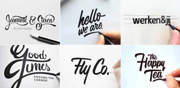
Despite the intensive development of mobile applications design, developers try to avoid standard fonts in applications. They increasingly change typing weight, typeface style, font size, creating idiosyncratic prints.
Thin font sans serif, that is usually shadowed a little bit, becomes more popular in desktop design.
Combination of bolder fonts with high resolution screens often improves readability and also helps to differentiate between the applications. Thin fonts are often used for modern designs of desk telephone set and mobile phones, where the text is the main element. It is also used where the background is graphics.
Despite the fact that idiosyncratic fonts are used for some applications in logo and titles, simple change of font weight and text size can differentiate them from the source code.
Design of mobile applications will differ from the last year design, first of all in brightness, rich colors, sharp typography with extended titles, and enhanced role of animation with cinemagraphs, GIFs, emotional animation, and micro animation. As for the rest, the trends for 2018 are continuation and increase of the 2017 trends, amplified by usage of the augmented reality technologies and machine intelligence. However, if we take a closer look at unique trends of mobile applications design in 2018, is becomes obvious that this is also a continuation of the trends of the last few years. The main trend, though, is still minimalism.
Article credits: This article is written by WOXAPP – mobile app development company


