Gone are the days when there was just one iPhone and developers had to design the apps for that particular orientation. Nowadays, there are multiple sizes and screen sizes available for iOS devices. It can be a challenge for iOS designers to create a universal app that adapts its UI for all the available screen sizes, iOS design patterns and orientations. So, what can be done to design a pixel-perfect app?
A mobile app should support any size display or orientation of a device to offer a great user experience. It is now easier to build apps that are adaptive to the size and characteristics of the device they’re being accessed from. View Controllers in iOS and Auto Layout in Xcode can make your app adaptive.
Starting from iOS 8, the OS comes with a new concept – Adaptive User Interface. The introduction of Adaptive Layout caused a paradigm shift for iOS application designers. It is now possible to create a single layout that works on all the existing iOS devices.
This new UI design concept allows the developers to build an app UI that adapts to different devices irrespective of the size of the screen and orientation.
In order to achieve adaptive layout, you will have to make use of a concept called Size classes that is available in iOS 8 and up. This is the major aspect that makes adaptive layout possible. Size classes and auto layout together can be used for designing adaptive user interfaces. In iOS 8/9/10, the process of creating adaptive layouts is as follows:
You can start with the designing of a generic layout. The base layout supports most of the screen sizes and orientations. You can choose a particular size class and provide your layout specializations. For instance, if you want to increase the spacing between two labels when the device is in landscape orientation.
Size classes
Size classes are the main feature of adaptive design. With the help of size classes, developers can eliminate code and logic that addresses multiple screen sizes and orientations. It makes it easier to have just one interface for multiple devices.
There are two types of size classes: Compact and Regular. Each size class can be represented vertically and horizontally, and each device is assigned a class for both the orientations. A regular size represents large amount of screen space, such as on an iPad. It also includes interface paradigms that provide a perception of extra space, such as scroll views on iPhone devices.
The “compact” screen size refers to a smaller amount of space available. iPhone or iPod Touches usually fit into this category.
| Vertically | Horizontally | |
| iPhone Portrait | Regular | Compact |
| iPhone Landscape | Compact | Compact |
| iPhone 6 Plus Landscape | Compact | Regular |
| iPad Portrait | Regular | Regular |
| iPad Landscape | Regular | Regular |
Step 1: Selecting a Size Class in Interface Builder
Open up Main.storyboard inside the project. You will come across the canvas, which is shaped like a rectangle. While jarring at first, it displays a core component of adaptive design. When you look at the bottom of interface builder, you will be able to see a button that says wAny hAny.

wAny hAny stands for Any Width, Any Height that indicates that any changes to the user interface here apply to every size class. If you click the button, a grid appears that allows you to toggle between different size classes:
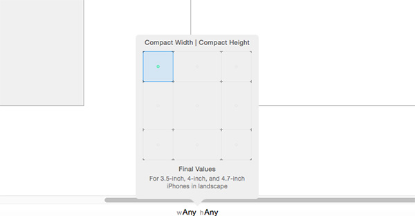
In the above example, Compact Width | Compact Height is selected and you can see a green dot in the blue grid. The green dot shows the size classes that are represented. In the example, changes only apply to 3.5, 4, and 4.7 inch iPhones in landscape.
Interface Builder uses the terms width and height while size classes use the terms vertical and horizontal. The width corresponds to horizontal and height corresponds to vertical.
If you have changed the currently selected size class, make sure that you switch back to Any Width | Any Height.
Step 2: Adding an Image
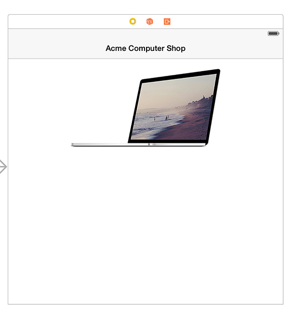
Drag an image view to the view controller’s canvas from the Object Library. Use the Size Inspector to set its X position to 0 points and its Y position to 72 points. Set the width to 600 points and height to 218 points. Open the Attributes Inspector and change the view’s mode to aspect fit and image to “Laptop”. The canvas should look like the image below:
Step 3: Adding a Label
Open the Object Library once again and drag a label onto the canvas. Opening up the Size Inspector, set the label’s X position to 16 points and its Y position to 312 points. For the size, set its width to 568 points and height to 242 points.
In the Attributes Inspector, make these changes:
set Text to “Silver Laptop”
change Font Size to System 100.0 points
set Alignment to Center
set Lines to 0
Step 4: Adding Constraints
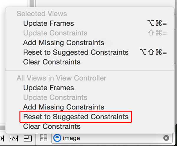
Let’s add constraints for the label and image view. At the bottom of the Interface Builder, click Reset to Suggested Constraints under the All Views in View Controller section. If this option is greyed out, make sure that one of the views in the canvas is selected.
The image view has the same white background as its containing view. It’s mandatory to change the view’s background color to make it look different. Select View from the document outline and change its background color to Group Table View Background color.
Step 5: Build and Run
At the top of Xcode, select the iPad Retina to use for the iOS simulator. Develop and run the app by pressing Command + R. The application seems to look fine for iPad, but developers need to ensure that it displays properly on every existing device.
Final Thoughts
Adaptive design is a great advancement in iOS development. With adaptive design, iOS apps can be developed for all the current iOS devices available in the market.
Author Bio:
Binay Jha has 16+ years of experience in software development industry. Currently associated with the management team of Software Development Company, he has a flair for writing on technology related topics.