Engaging you students with visuals is very important for learning. Not only will you directly help your students who classify as visual learners, you will further engage your classroom and even help prevent boredom. But which visual presentation format is the best to use?
Have a look at our list of the best visual formats for educational presentation in 2016 to discover the best visuals to use in your next presentations.
- Map versus Generic Infographic

Looking at a map is a great way for your students to visualize the information they need. Whether the statistical information you’re sharing is localized or on a global scale, they can easily see how far the statistics reach and what areas are affected.
Maps are great for showing your students health or economic statistics. And they are easier to read than a word filled infographic. Not to mention, you can show the entire data with a visually enticing way.
- Iceberg Charts

Iceberg Charts are awesome for tactical planning for day-to-day uses. You could also implement an Iceberg Chart for long term strategic plans. These types of charts get their name since they visually represent an iceberg. You can easily see the current state of things, but take it further to a deeper level of expected or potential outcomes and/or information. In mathematics, these charts are often used to represent equations or theories.
- Void Chart
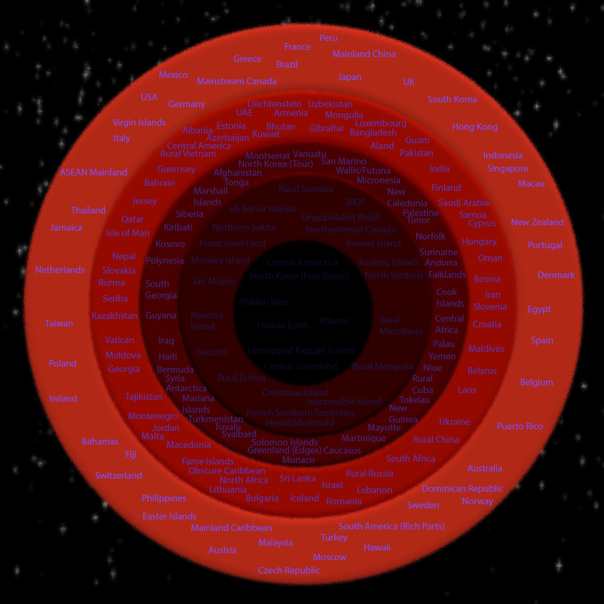
Void charts are often seen to visually represent the cycles of the moon. However, they are also useful for representing info either in layers or showing how one layer will relate to the other. To give an example, if you used a void chart to represent population, you can easily show the highest population densities in the center and work your way out as the population decreases. Even though it is easy to represent this data, it can sometimes become complex or even difficult to read.
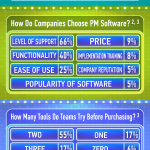
- Funnel Chart

Funnel charts are very popular because they are easy to use and easy to read. You can easily view how the funnel will affect the data you need to represent and these types of charts are often used in marketing or business.
- Speedometer Chart
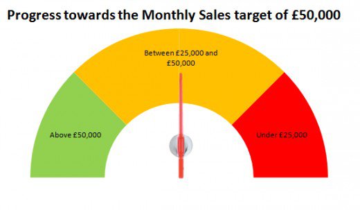
These types of visual formats are named since they represent an actual speedometer. They will use a needle to show how poorly or how well your data is preforming. Since they are seen in three stages and/or colors you can quickly examine the chart to compare your data or measure your goals or expected outcomes.
- Water Bubbles Chart
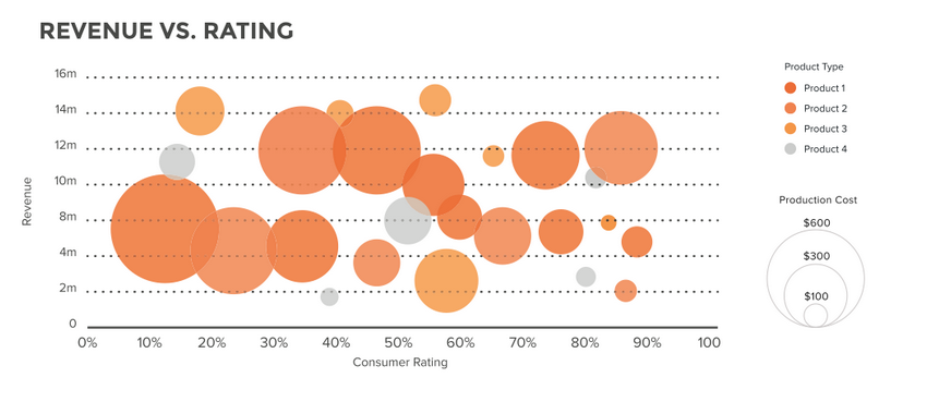
Water Bubbles Charts are very similar to a scatter chart but they do not include the lines. You can see up to three dimensions of data across the horizontal and vertical planes on the chart. You can quickly see how well your data is performing and how long it has been doing so. These types of charts are great for sales or other types of financial data.
- Question-Answer Infographic
Infographics are typically seen in the business world, but you can use them in the classroom as well. They can include short bits of the most vital pieces of information as well as relevant and interesting images. Question-answer inforgraphics are used to exhibit the direct paths of your data so you can find the overall and expected outcomes.
Nearly any data and information can be used in a Question-answer infographic. If you use a great font and find the perfect images, it will not only be engaging and easy to read, but it can even be fun for your students.
- Pyramid Chart
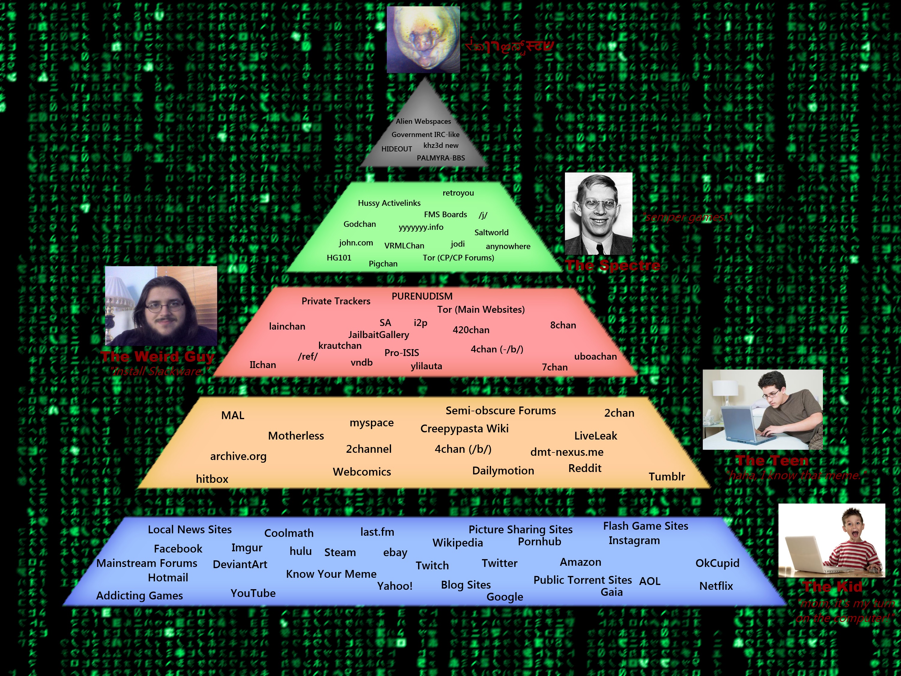
Pyramid charts are given their names since they resemble a pyramid. The most famous being the food pyramid. They can display a broad range of information in subjects such as health, economics, or even business. It is easy to see how each level of data affects the other and even notice correlations between the data.
So next time you are planning a lecture for your classroom, include one of the best visual formats for educational presentation. Keep your class engaged and learning more with the help of these visuals, they are the best from 2016!
About the author:
Laura Carter is a blog writer and editor at dissertationwritingservices.org. She has years of experience in educational field and always glad to share her knowledge. Follow @carterlaura15 to see more from her!