Designing mobile application interface is new different way is very intuitive idea. So first of all to design something new, you should know about creativity and creativity can’t be taught. It should be learnt by doing different things. You can explore your own idea by your creativity and I believe that a well designed app is the key to success and it is a good strategy to design an app interface. The user interface must be the primary focus on the requirement of target user audience. The significance of UI cannot be ignored by anyone.
When conceptualising your mobile app’s user interface, there are a few things that you should keep in mind. Some of the basic things such as clarity of interface, consistency from one view to the next, and making sure that tapping on any button or UI element provides feedback to the user are fairly straightforward.
Some points to help design the mobile application in a unique way
- Ideal button size

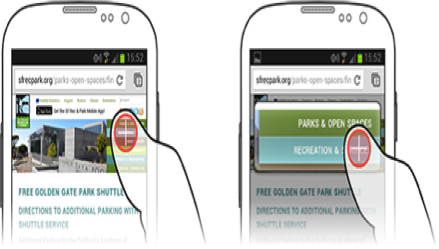
Button size is really matter a lot. Sometimes it is small to our fingers so we’re unable to touch accurately. Aside from minimum button size there are some benefits to non uniform button sizes. As a general rule of thumb, the size of button should be a standard rule.
- User interface location

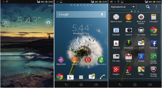
Usually, application UI elements are either placed at the bottom of the app (most common) or at the top. So sometime it difficult to manage the things in the right way. Generally it is best way to keep the primary applications at the bottom of the screen.
- Create the back button according to your platform expectation

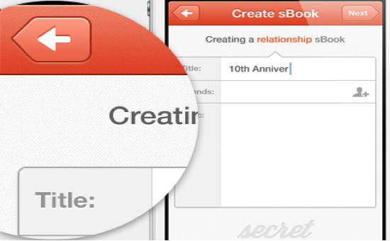
It has been seen that the application back button must navigate the app user back consistently. If you are creating an Android application the native OS offered back button should be served. Because, as you develop the Android application you should create an back button on the top left corner as the user expects. OS specific behaviour back button should be created according to user expectation.
- Rule of thumb
Always remember the thumb rule because when you design an interface you should know about the accounting motion and the user interface position and where it should be placed. It very important to know about the customer requirements regarding what he expects from the developer and it is a responsibility to decide what elements should be placed.
- Use the popular icons

You can use the popular icons in place of words. For example, you can use a icon play as > triangle sign and || used as pause icon. There are many more popular icons available so use it well.
About the author:
James Mervyn is a Social Marketing and Apps Promotion expert with 5 years of working experience. He can help you to Increase app Reviews and make your apps popular.

