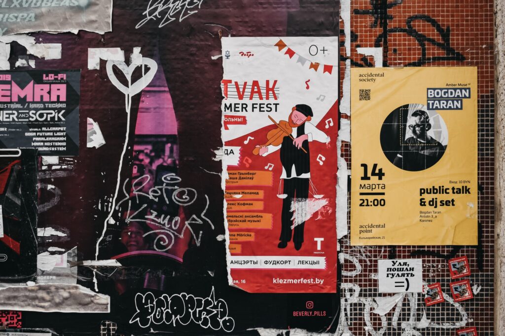
Many people believe that a quality product does not need advertising; it will be in high demand anyway. However, this is not the case. Even the most famous brand needs proper advertising and branding. That is why we are witnessing “tough advertising fights” of brands, whose main weapon is advertising design.
The Art of Creating Effective Advertising
Modern marketing realities once again prove that advertising is one of the most powerful tools for communicating with a consumer. Of course, advertising is everywhere today, and a customer cannot perceive the numerous advertising messages. In order for your ad to be noticed by your target audience, arise interest, and spark discussions, it must be original, bright, and attractive.
If you want to get a colossal effect from an advertising campaign, then you have to put tremendous effort into preparing it. If you want your brand to overcome all the competitors, then the ad design must be luxurious and rich. In this post, we are going to share with you the top 6 tips that will help you create a high-converting ad for your company and brand. So keep reading to make your marketing campaigns perform at the max.

Photo by Darya Tryfanava on Unsplash
Tip 1 – Place & Structure Your Ad Elements Correctly
It is important to place the main details of your banner in the correct order. Any banner must contain:
- Company’s logo;
- Offer;
- Visual presentation of a product or service;
- Call to action.
The most visible elements in your ad should be a sales pitch and a call to action. Place the logo in the corner of the banner, preferably in the upper left corner. The image should be relevant and attractive, but make sure that it doesn’t obscure other elements of your ad.
Tip 2 – Use a Prominent Call-to-Action Button
The call-to-action button serves two purposes:
- Motivates a user to click on your ad;
- Removes doubts and hesitation of a potential client.
The best place for a call-to-action button is the bottom of the banner. The button should contrast with the background and other elements of the ad. For banners used in digital marketing campaigns, clear and understandable calls to action are best. In other types of advertising, the calls may be more subtle, but they are not suitable for banners on the Internet.
Tip 3 – Choose Your Images Wisely
Obviously, the image must be attractive. It should also be relevant to the topic. Here are some tips for choosing the right image:
- Do not use photographs unless necessary;
- Use filters and graphics in your ads;
- Try to select images based on the location of the text and CTA on them.
In case you already have a visual and need to retouch it, then you can always use this service for the purpose.
Tip 4 – Match Colors Correctly
The choice of color is the most important part of creating banner ads. Each color conveys a specific emotion. There is no one-size-fits-all color combination advice; it all depends on the type of ad, business, and audience. For example, it is believed that younger users are more attracted to light colors, while the older generation prefers dark colors.
Try to choose a color that matches the characteristics of the product. For example, green and yellow are great for promoting natural foods, healthy eating, and more. At the same time, purple is suitable for advertising professional specialized products and services.
Tip 5 – Include Metaphorical or Surreal Visuals in Your Ad
While the basic tenet of online advertising is to create clear and simple ads, using metaphorical or surreal visuals is often effective.
Tip 6 – Show Movement
You can use animation in banners, but adding movement to a static image gives a special liveliness to the ad. You can also use capital headers in the text. This will draw the user’s attention to the necessary elements of the banner and add even more dynamism to the ad. So if you want to focus customers on a specific messaging, then use properly formatted headers for this purpose.
Final Say!
The guidelines listed above are not universal. You can only pinpoint what works best for your audience and brand. The main thing is to remember the relevance of the ad and the landing page, and also try to create banners focusing on the site design and corporate identity of the company.
When users see an ad and click on it, they should not be taken to a page designed in a completely different style and with irrelevant information. Combine creativity and marketing techniques and create attractive banners that work specifically for your target audience. It is also highly recommended to A/B test different options and choose the top-performing ones.
Cover Image Credits Unsplash


