Yoga is one of the most popular forms of fitness activity. Even the top fitness tracking brands are including yoga in their list. Yoga websites specifically require more than a name, number, and description of services. We examine how to connect with potential yoga clients and what makes the best sites the best.
Yoga is a serious discipline, and as yoga sites pop up, it’s important to know what it takes to have one of the best websites to connect with would-be yoga practitioners.
Beyond twisting and stretching, yoga is a complex art form that balances spirituality with individual awareness and fitness. Depending on the type of yoga being done, the balance can shift heavily toward the spiritual or to the physical benefits. Yoga requires fewer instruments, a man will do, that’s it, you don’t need big instruments. This is one of the reasons why 43% of the people do yoga at their home and 40% of the people do in the Yoga studio; a survey shared by a yoga journal.
The best yoga websites made by yoga centers, yoga instructors, and general educators have a few factors that separate them from the rest. Let’s explore what those factors are.
For a yoga teacher website I recommend these pages and modules:
- Homepage: big header image, intro copy explaining who you are and what you do, content boxes with more information on services, testimonials, latest blog posts.
- About: More information about yourself, your education as well as some nice yoga pictures.
- Classes: Information on your classes, where you are teaching and your schedule.
- Workshops/retreats: If you are offering these, a page showcasing your latest events.
- Blog: A blog where you write about what’s close to your yoga heart.
- Contact: Contact form as well as other options to get in touch with you. Don’t forget your location.
This is the heart of your website, so take your time to develop your content. Have someone else proofread your copy, get some great images done and have everything ready for the next step. Check out my blog post about the principles of great website design to learn more.
The best sport websites templates

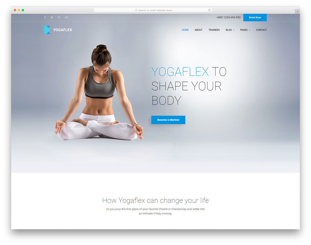
Yogaflex website template lets the user feel the peacefulness and freshness with its clean design. The clean white background of the template and apt image selection gives a floating illusion to the template. Each section on the homepage is brief enough to give an overview of the services you offer.
A separate page is given for the trainers, where you can clearly mention their expertise along with their social media profile links. To distinguish the footer section from the main content area, a dark theme is followed. This template is the best option for Yoga studios and fitness centers.

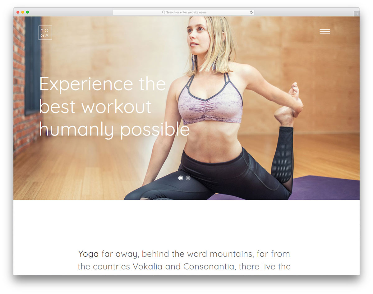
Yoga is a perfect website template for both personal trainers and yoga studios. The creator of this template has made it creative and easy to customize. Visual effects are combined with this creative design to give life to the template and they also help you to engage the visitors effectively.
This template uses a table to neatly show the daily schedule; you also have a call to action button in the schedules to let the user directly join the class from the table.
Icons used in this template are unique and mostly related to the yoga and fitness theme, which will help you elegantly list your services. An edge to edge stretched widget is given near the footer to share your Instagram feeds.

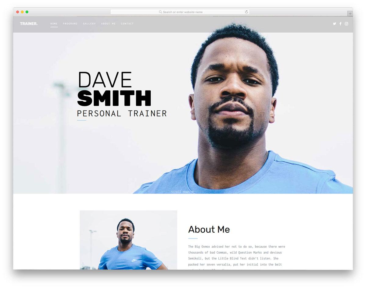
The trainer is primarily a personal website template for personal trainers. Texts are bit different from the normal font you would expect in a professional website. But the readability is great with the font used. Lots of white space is given in this template to present the contents elegantly to the users. In all the subpage you have an image section in the header with bold texts.

Hospice is a neat looking simple website template designed for health-related websites.
The developer of this template has made the code structure easy to customize so that you can add or customize features easily in this template.
An ample amount of space is given for the image contents so you can explain your features and services engagingly to the users. In the contact pages, you have an interactive map widget to help the users easily find and locate your studio. All the basic optimizations are done in this template so you can concentrate on your customization part alone without any worries.
It shows and tells what the yoga instructor can offer/do for potential clients
Part of conveying the story and benefits of a yoga instructor or team of instructors is showing the value, knowledge, and experience they have. Demonstrative/instructional videos of classes or sessions as an example can go a long way. The more value that is offered, the better, and the more opportunities they offer. Short videos and articles are easily shareable on social media and can drive potential client traffic as well as exposure to the general community about instructional quality and technique. Explanatory content on a yoga website should go into the type of yoga and meditation practices that are offered/followed and what makes them unique/beneficial. It’s as much about showing services as much as it is about differentiating from the competition.
Its design is easy to use and aesthetically pleasing
The best yoga websites are also at their root-like any other website. They should be easy to use for even the most computer challenged people. Overly dense or non-fluid designs can make it a challenge to use on mobile which is becoming a driving force for how many site visitors are finding recommendations. A site should be well balanced for any platform that its target audience will be using. Yoga websites are in the end one of many tools for conveying the power of yoga to the curious and to familiar alike to find a home for their spiritual and physical development, so it’s important to put the best foot forward possible.

