You will find two kinds of websites out there. Those that attract and interact with visitors and the ones those don’t. A website that looks cluttered or doesn’t convey the core purpose of your business can’t attract the visitors and turn them into customers.
Even though every business nowadays is going online with a website or app, they fail to do it effectively and tend to fail. Along with being a marketer, the businesses also need to focus on creating quality content and designing great user experience.
There should be a fine balance between engagement, marketing and selling.
If you are building a website, then you need to take care of a number of things so that the website can appeal visitors, convey your message to them and drive engagement.
To make things easier for you, we have curated the website design checklist that features the most important elements your website must have in 2019. So it’s a must for your web developers to work on this element and latest technology in mind.
Mobile-friendliness
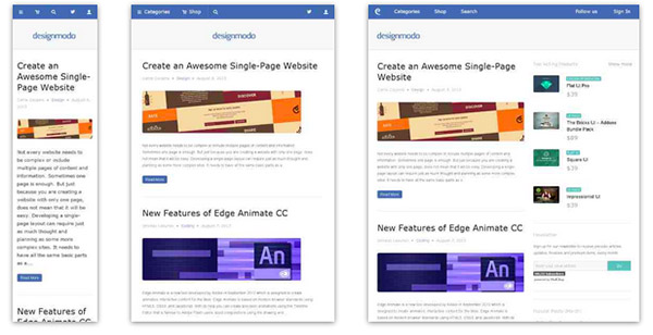
Having a mobile-friendly website is crucial for every business due to the increasing number of people visiting websites from their mobile devices.
According to Statista, 52% of the people visited websites from mobile phones in 2018, up from 50% in 2017. This shows that more website traffic is generated from mobile devices than desktops.
If your website is not mobile-friendly, it is very likely that over half of your visitors will have poor user experience and abandon it without browsing any further.
Further, Google’s SEO algorithm now uses the mobile version of websites to rank the pages in search results. Hence, it is important for your site to be mobile-first for better SEO as well.
If you don’t know whether your website is mobile-friendly or not, you can test it here.
Effective and memorable logo and header
Logo and header of your website are the first things that visitors come across. You have to design the header in a way that highlight the logo and shift user’s attention on it. Both the logo and header should be clean, simple and effective so that people can easily remember it. It is a key part of branding today.
Easy navigation
The navigation on your website should be easy to comprehend so that users can easily navigate to the desired web page without having to put efforts into finding one. Keep the main menu on the top of the website, right below the header so that your offerings and main things become a priority.
While setting up the menu bar, try to include not more than five items. This will encourage users to click, rather than making them think too much.
Informative ‘About Us’ section
The main menu should have the About Us section, which clearly tells the visitors about your website, its goals and services. You can also include success stories and testimonials to impress visitors.
A number of things should be taken care of in this section, such as you should keep it short, brief and simple, because people click here to know about the website and not to read an essay. Improve readability by adding bullets where necessary and utilizing the white spaces.
Contact Info
After going through your profile and services, visitors look for contact information to get in touch with you. Contact information shows the reliability of your website to visitors.
You should have your email, phone number, physical address and other info on your site under a ‘Contact Us’ page. You can also add the directions via a map for local users.
This page can also be included in the main menu. If the items in your menu are more than five, then you can place it in the footer of the website.
Space
Website designers today understand the importance of spaces in the content on web pages, as well as in designs. The spaces define the way visitors interact with design and content. Open space enhances readability and user experience. Nobody likes a cluttered website even if it has valuable content and relevant services.
Keep space among the sentences and paragraphs and be consistent with the alignment of text on web pages. You can also bold the keywords to drive user attention. Highlight the buttons for encouraging users to click.
Search tool
You might be having several web pages and posts on your website, which can’t be found on the homepage. To help users find whatever they are looking for, provide search functionality on every page. It should be placed in the right place so that users don’t have to struggle to find it. This functionality can be added in the form of a search box or a magnifier icon, whatever best suits your design.
Sidebar
Make the most of sidebar on your website by placing the most important things about your business on it. Use the same content on the sidebar for all the web pages and blog posts so that it gets attention no matter on which page the end users land.
Social media icons
Social media platforms have transformed the world of digital marketing by driving effective communication with visitors and customers.
After setting up social media handles, integrate their links along with icons on your site. Ensure that these icons are visible easily. You should consider placing them on the header, sidebar, or footer.
Great images and videos
Use of professional and great-looking images on the website is always good for showing that you are an experienced brand. You should use relevant images on every webpage to make the content interesting. A well-designed webpage with the right content and images can make the difference between a visitor buying your service or abandoning it.
Along with images, videos are also gaining traction nowadays because people like things being served to them. For example, a video in the ‘About Us’ section can speak for your brand rather than visitors having to explore or read everything.
Hence, try to include at least one video on your website for better and quick understanding.
Wrapping up
In this article, we have mentioned the best practices you should include in your checklist before setting up a website. These tips and steps will help you to engage visitors on your website and convert them into customers.
Know of more such practices; feel free to share via the comments section below.
Author Bio
Vaibhav Shah is the CEO of Techuz, a top mobile app and web development company in India,USA and Singapore. He is a technology maven, a visionary who likes to explore innovative technologies and has empowered 100+ businesses with sophisticated solutions.


