When we talk about imagination and creativity, there is no one that understands it except the designers. One of the essential skills that a designer needs to learn is being unique yet a trend follower. Trends are the skills and styles that are common for a particular period of time, and it is essential for a professional graphic designer to adopt them and be the masters of it for the clients.
As for the entrepreneurs, it is also crucial for them to follow the brand trends and styles to keep the masses engaged and appear contemporary to the audience and the competitors.
One of the best ways of following trends is to follow what the international brands and companies are doing. Keep a lookout for famous brands like Apple, Amazon, Spotify, etc. to be updated on the types of images, colors, fonts, and styles they are using for designing. It is usually that these renowned companies are making styles and trends for the businesses smaller than theirs. There are many various sites from where you can get your trendy ideas and come up with something even more creative than the original idea. Recent movies and T.V. shows can also help you with being updated on the latest trends.
As for the article, it is going to describe the recent trends that you can follow to be on the top of the creative and trendy designer’s chart. As the saying goes “everything old is new again” I won’t be wrong to say that the designers today are reviving every old designing trend back to life with a modern edge to it.
If you’re a designer and if you want to add some contemporary flairs to your designs, these design trends can help you to wow your customer.
Responsive logos

While designing a logo, it is essential for a designer to make it simple and scalable. What it means by designing a responsive logo is simply that it should be able to provide a proper user’s experience throughout the various mediums like a cell phone or a billboard without losing its flexibility and essence. They need to be versatile to follow the responsive principles.
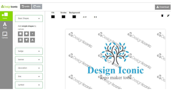
A designer needs to handle the logo designing style for a thing as fragile as a business reputation very carefully. You as a designer need to provide your client with something creative and unique. When you’re planning a simple draft for your design, it is best to make your own logo free on an online logo maker just to get an initial idea. Then you can tweak it and change it into your own unique essence and creativity into it.
Gradients and color transitions
It is one of the trendiest design of the past. Designers used it to add a unique effect of colors to the designs to make it look more attractive and compelling. Remember the word art where gradient colors were added to make our school presentations look more attractive and professional? Well, that professionalism is back with a transitioning effect to the designing industry.
It all began when Google introduced the material design, and windows introduced their metro in 2014. The gradient includes a variety of colors and shades to give a color transitioning effect in the design. It can be used in a logo that you create for a company, or you can use it in various images.
Gradients help in unleashing the best of creativity in a designer making him or her capable of inventing a new color every time a designer creates a design. In the modern times, we have seen the gradients used in the Instagram and stripe icons, where the designers are using it as a tool to enhance their flat nominal design without making it a core focus. They are coming back to improve a flat design.
Unconventional color scheme
Like the gradients, designers nowadays are using different color-pallets and schemes to grab the eye of the audience. A unique color scheme gives you a chance of being more expressive, especially if it’s a logo design. It helps you to convey the facts in a compelling way. This trend is specifically trending on social sites like Facebook where companies are fighting for the user’ attention.
Fast companies take advantage of various color schemes and mixing them to create something unique. That’s not it; designers are using them to design magazine covers for it to be more captivating.
Patterns inspired by the 80s and 90s
Speaking about patterns, does anyone from the 90s remember the 80s pastels and electric hues? Well, they are in trend once again. People now want to see more abstract and geometric patterns that are moving into the mainstream of the designing industry.
As the 90s kids are becoming a part of the regular audience and the brand leaders, they want to see something that reminds them of their teen days adding a visual excitement in your design.
Designers are also using basic shapes to design logos centralizing the focus on the central element. It uses simple circles, triangles and squares coupling them with a simple text I a creative font. This gives the designs a conceptual and powerful impression making it more compelling for the audience.
Duotone exposure
This is the trendiest designing technique used by the designers. Though it’s not that old, it was becoming slightly outdated because it commonly used animals in nature composition. Now it is re-emerging and becoming more sophisticated using vivid colors and different shades to give an image a double toned look.
Designers mostly use this in making movie posters and advertisements. In this style, two different images are overlapped creating a double effect. Duotones are best used when I come to designing a banner which had limited space and a lot to tell.
It is highly believed that duotone exposure is going to stay in the designing industry for quite some time. It will be followed by the designers in new ways, this way a designer will be able to achieve an ahead of time effect.
Typography
Typography has always been in trend, as it gives a direct message to the audience. Designers everywhere opt to use the ever famous Helvetica inspired sans-serif font to be visible on the online platforms. The serif font has a reputation in the digital world, especially when paired with san serif.
“The bigger the font size, the more attractive your design will be” is the motto of the trends of typography in 2018. Designers go for bigger and bolder headlines in extra-large font sizes.
It is expected for the serif and sans serif fonts to stay in the designing industry as long as it remains. The only possible change for the creative people is going to tweak it into a better and more creative side.
Conclusion
These are some of the latest trends that a designer must master for the sake of the customers. The designing world is evolving to be a dynamic and exhilarating industry, and it is exciting to be a part of something so captivating. As the past designing trends make their way to the future, the designers will have a chance to hoist these designs to emphasize originality and creativity.
Author Bio:
Jessica Ervin is a creative graphic designer who works with Design Iconic which provides free logo maker services from where you can easily create your own logo designs for free with unconventional logo designs, Powered by AI for creating astounding logos. Her experience has given her an insight of designing along with a diligent technical skill.


