Gone are those days when the retailers used to sell products physically from their shops. Today’s world revolves around the technology and the physical shops are also getting a digital makeover. Online stores have opened a whole new window for the reputed sellers and new markets for the aspiring ones. Through these online stores, your business will be available 24/7 for the consumers and you can reach to millions of global customers without investing in emails and call centers. It’s a huge boon indeed. And that’s why various proficient web development companies like Intlum have come forward to develop a worthy online store for your business.
Well, everything of the above seems like a dream till now, isn’t it? But achieving all the benefits would not be an easy task. A plethora of different aspects need to be taken into consideration while designing a successful eCommerce website. Installing shopping cart software and implementing products into the database will not be enough to get the job done.
As the result of inadequate knowledge and skills, a boatload of mistakes takes place each and every day while developing an eCommerce website. Considering the mistakes and their vicious outcomes for a business, we have garnered the top 5 common mistakes in eCommerce website development and mentioned the tips to fix them. So, once you go through the article, you’ll be able to eliminate all the glitches that can ruin your site. So, without further ado, let’s get straight into the main topic.
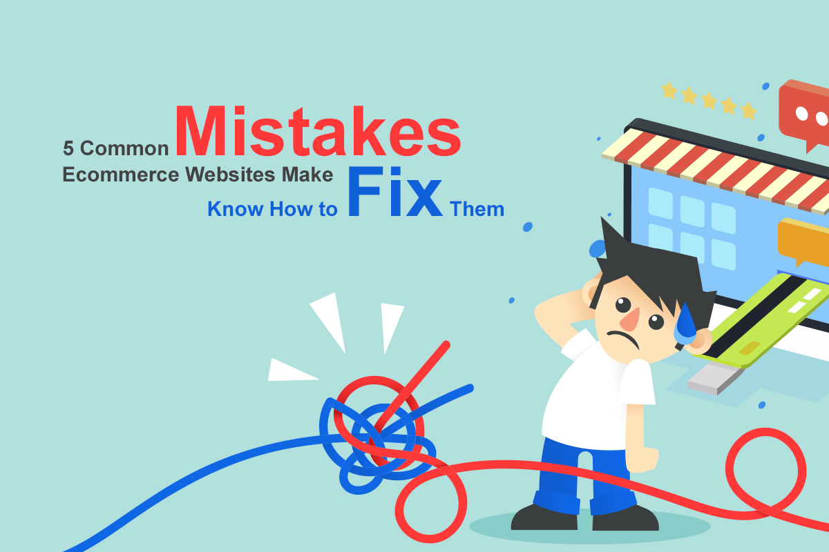
Top 5 Common Ecommerce Website Development Mistakes and Tips to Fix Them
Following are the mistakes made in eCommerce website development. Read them carefully and evaluate whether you’ve made the same mistakes. If you have, don’t forget to apply the tips to avoid or resolve the mistakes. So, let’s take a tour.
Prolonged or Puzzling Checkout Process
The checkout process is the last obstacle of an eCommerce website in the conversion funnel. Thus, you need to be careful specifically in this segment as you would not want to lose your almost-converted client to leave your website just for a complicated checkout process! This can be one of the most vicious mistakes an eCommerce website can make. The process should be easy enough for the users to provide their credit card information and complete the purchase. The longer time it will take between placing an item in the cart and making the purchase, the more skeptical buyers will become in buying items from your website. Eventually, they will leave the site without making a purchase.
How to Fix
The epitome of a perfect checkout process should incorporate a single page which would allow the buyers to check their orders, enter the billing details and shipping information within the same page along with a confirmation page before they finally place the order. Follow the model as precisely as it can be followed. If other pages need to be embedded, make them easy enough to fill out. You can opt for combining the pages such as keeping the billing and shipping information in one page for the ease of filling and using. If you don’t want to make the page long, make use of two-column layout.
Absence of Detailed Product Info
The hindrance that mostly occurs in the online shopping is the insufficient knowledge of a product before purchasing. This is the reason many of the online buyers abandon a site. Basically, the brick-and-mortar stores offer a great advantage of previewing and gauging a product before buying it. The buyers can see the product from every possible angle, feel it and read every little information about the product mentioned on the labels or packaging. On the other hand, online shopping sites do not (and cannot) offer the same sort of facility and interaction during the purchase. Often, we go online for a product purchase and find that the product description or specification is missing the necessary information that we are craving for. When buyers would wonder about the specifics of a product, they will never think twice to find another site to grab the information.
How to Fix
Put as much information as you can on the individual product page. You have to be specific and precise about the size, dimension, weight, materials of a particular product or the variations of the specifications. All the specifications will depend on the product type. For instance, if you are describing a mobile phone, you should always write about the specification about Camera, RAM, OS, Internal Storage, Battery Type, and Capacity, etc. All these specifications will help a user determine whether the mobile worth purchasing. If these details are missing, they will always find another website to acquire the information. Also, you should mention the brand description if you have a marketplace filled with third-party sellers. Use descriptive words rather than the technical words to create the best impact on users.
Also, Check Our Other Articles in Layerpoint
Hidden Contact Info
When the consumers hand over their credit card information and other important details on a website, they would surely be eager to discover the website’s or the company’s authenticity. They will also try to find a solution which can help them if they fall into any problem in future. The users would always want to talk to a real person who can help them in any issue. Now, if your website does not contain any contact details, the potential buyers will consider that as a drawback for them and deem your website as an unauthentic one which can trouble them in the future. So, if your eCommerce website users don’t find the products easily, they’re less likely to make a purchase and more likely to shift to another website.
How to Fix
In order to fix the mistake of hidden contact information, you should always put your contact details either on the header portion, the top of your website’s sidebar or in the footer section. One great way of adding enhanced user experience to your eCommerce website and the products is to add multiple methods of contacting. Mention your company’s email address, phone number, and other sorts of contacts to let the visitors contact you in their comfortable way. Keep in mind that the more expensive or technical your products are, the more urge users will feel to contact you.
Account is Compulsory to Order Products
Do you remember the first point where we mentioned that puzzling checkout process would ruin the user experience and provoke your website users to leave your website? Of course, you do since the point is one of the most lethal mistakes eCommerce websites do. Well, the necessity of a user account on your online store for making a product purchase will certainly make the hassle twice for the users.
When a user lands on your website, they should never be asked to sign up to complete their purchase. This will take time and nobody has the time to invest. While gathering user information is effective, making it compulsory should not be your approach. Initially, you should determine your goal – a product purchase or user info.
How to Fix
Well, it’s an easy fix! You can ask the consumers to sign up at the last stage after they complete placing the order. When they would find the signing up option at the last stage of their order placing process, they will certainly be enthralled to complete the task. On the other hand, asking for it at the beginning may bring hassle to you as they are never going to place the order anyway! Now, there’s another way how you can secure an order placement – you can keep both the options alive for the users by having a Sign up Later option when the users proceed to checkout. But making the users mandatorily create an account before purchase would lead you to lose some of the potential consumers.
Insufficient Search Option
Not each of your website visitors or potential buyers would come to your site and browse the products randomly. A good number of the customers will surely have a product decided in their mind that they specifically want to buy. Now, when this sort of cases appears, the users land on a site and directly search for the particular product by searching it on the search bar. If your website’s search feature does not work well, you are surely going to see a downfall as none of the consumers would find the product that they are looking for. As a result, they will be pissed and they will certainly leave the site and find another one. Thus, your eCommerce store should contain a working search feature along with the sorting and filtering option to offer the best user experience.
Moreover, you should also pay attention to the search result. Often, we search for a product and see hundreds of search results. While the variety can be viable for your site, the applicability of those search results also matters. You cannot show just any product in the search result. The result should be related to the search.
How to Fix
In order to fix this mistake, you need to find a reliable eCommerce software that contains an inbuilt search engine which can help you find your desired products. You can also look for the plugins which can extend its functionality. You should always allow the users to search for a product with the keywords and the search results should be refined by the categories that your website contains. Also, keep product sorting facility by the price, popularity and items’ arrival time.
Final Words
So, the above are the 5 most vicious and lethal threats to the eCommerce websites. Most of the websites repeat the same mistakes which have been described above. If you want to make your online store one-of-a-kind, make sure, you are eliminating all the mistakes and take an action just how we have mentioned. In this way, you can keep your eCommerce website unharmed and bring it to the right spotlight that it deserves.