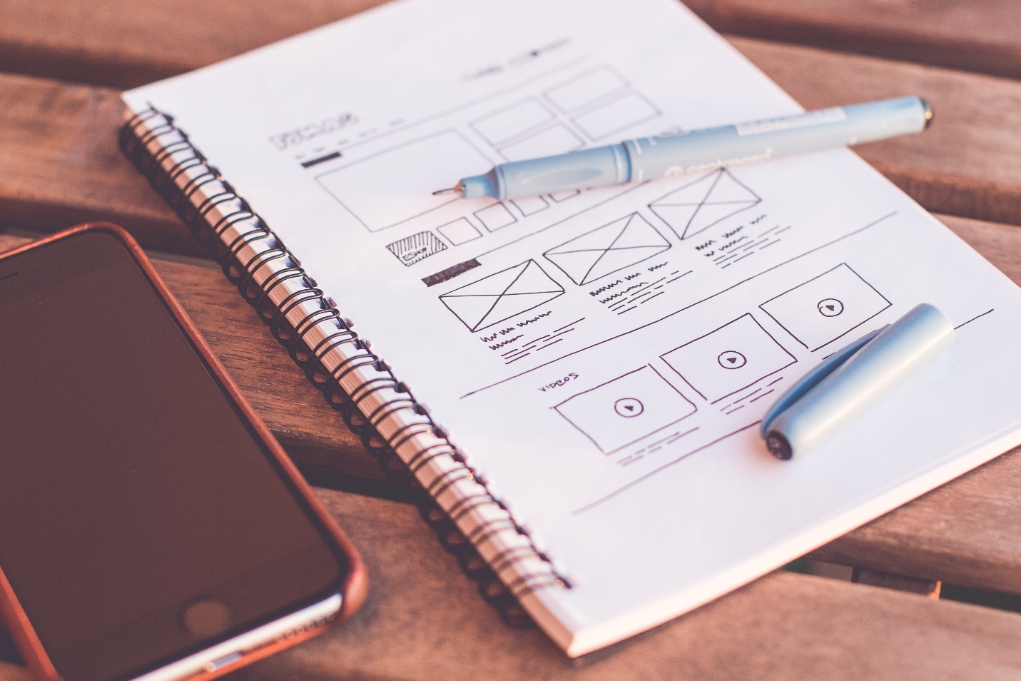
An exceptionally designed website is the fundamental foundation around which all your marketing efforts will revolve. If the UX of your website isn’t good it’ll ultimately affect your revenue one way or another. A fine user experience engages the users and helps them find quickly what they were searching for. Considering the change in the marketing landscape these days, every designer needs to know that the website they design is not for them, but for the people who are going to visit it.
Refining your website to make it user-friendly is essential if you want to increase your conversion rates. I’m Saad Raja, an experienced UX designer and I’m here to share a guide on how a designer can enhance user experiences on their websites.
1) Use white space properly
White space is essential for good design as it not only makes the content legible but also assists users in focusing on what is actually present on the page. Always remember that cramming the site with content will never help which is why you need to effectively incorporate white space in your design to increase user attention spans.
2) Make navigation easy
If a user cannot easily find what he needs, he is not going to bother with your site at all.
Due to this, it is highly recommended that as a designer, you need to make things simple for your visitors. Do not overcrowd your menu to an extent that the user is unable to take a decision at all. Add navigation in a way that the reader is allowed to skip through content and directly jump to see what he was looking for or let users have the option of onsite search to quickly find what they were seeking.
3) Optimize your page speed
Who would want to visit a site that loads frustratingly slow? If your site does not load in the first few seconds, chances are that people will move to something that does. Slow loading pages are surely the biggest disruption in user experiences and as per statistics; a 2-second delay in the loading time of a page will lead to a site abandonment rate of 87%.
4) Give appropriate Calls to Action
First figure out how you want your user to react to the content, and then structure your CTA. Making sure that you use the correct words and attach either an emotional or psychological association to it will trigger your sales. They should also be worded in a way that the user is compelled to take action and reach the next step. Phrases like ‘REGISTER NOW’ or ‘HURRY TO AVAIL IT’ will provoke your users to actually try it out.
5) Cut out excessive fields
If you are adding forms or sign up processes on your sites, try to minimize the fields that you are asking your users to fill. If somebody is looking for something online, they probably do not want to fill out extensive and irrelevant details, and they would rather avoid sites that require these.
6) Create responsive designs
Craft your site in a way that the users get an optimal experience no matter what device they view it from. If your site works well in different viewports, it will make your site more consistent for the visitors.
7) Design your images well
Images have the potential to influence the impact that your site will have on your users. As a designer make sure you come up with creative and relevant images. Designing your own images rather than choosing them from stock libraries will help develop a bond between your users and the brand. Also, using images in a strategic manner and carefully placing them between the texts is a characteristic of good design.
8) Interact with your users
Features like language translation, live chats and other forms of communication significantly build up consumer loyalty and make the business look more credible in the eyes of a user.
9) Choose correct color schemes
Color schemes that you use in your designs play a pivotal role in building the user experiences. You certainly do not want to blind your users or bore them with your color choices and hence, designers are encouraged to build color palettes that help the user relax and cast a positive impact on visitors.
10) Break down text suitably
Nobody would want to read huge chunks of text no matter how useful they are which is why the use of bullets is constantly emphasized to designers. Bullets will not just make your text look more welcoming and attractive but also be beneficial to users in quickly scanning the content to see what they need.


