If you own an online business, you might as well know how important web design is for an ecommerce website. A good web design is the combination of aesthetics, elements and color theory that work cohesively to ensure the viewer gets a valued experience. Without an attractive architecture of an era appropriate web design, and the right combination of colors to breathe life in it, a web design is as useful as a bucket without a bottom. In this article we will discuss the importance of aesthetics and color that can influence user behavior through a web design.
What is Web Design?
Web design is a process of conceptualizing and implementation of ideas to produce a group of electronic files that contain all the necessary elements such as layout, structure, visual detail, text styles and other interactive features to engage and convert your customers.
In short, web development involves a qualitative process of collecting ideas, and arranging them according to their aesthetic requirements before they are implemented, tested and put live in action. It creates a platform to present content on the internet where everyone can access it. A web design is built to influence user behavior so it can benefit the merchant in several levels.
4 Primary Elements of Web Design
- Website Layout
Layout of the web design brings a significant impact on the user behavior. It is the frontline of interaction and holds all the important elements such as graphics, ads, text, images, videos and tabs, etc. If the layout is user savvy then it will invite visitors and increase your store conversions. However, if the layout fails to keep the elements arranged and does not feature images and banners according to the latest trends and standards then the user will most likely get irritated to the point of abandonment.
- Visual Detail
Graphics, image formats and videos are all responsible for producing a visually attractive web design that every online user can like. Adding images and videos are not just important for marketing your products more effectively, but also a great factor for increasing user engagement and stimulating faster purchase decision compared to a text centric website. Images produce awareness regarding a product and instigate the customer into investigate the product. Graphics include logos, clipart icons, infographics and all sorts of animation in the web design. A decent amount of everything in their right place is good; but overkill can possibly work vice versa. Too much graphical detail without enough text to explain can not only increase website loading time, but also disorient the viewer. Keep an optimum amount of graphics and avoid using high end animations.
- Text
Text is the matter that builds up a web design. Without its presence a website can become hard to interact and navigate. Every element on a website needs text somewhere at some instant, but using it requires a set of rules that every web designer must know. Text is best used in small lengths, but as meaningful as possible. Latest trends suggest that online users are never too involved in reading texts while surfing the internet, but even if they do it only for a matter of seconds. Your job is to make those seconds count. By using the right keywords, combined with the ideal font style to enhance readability, you can easily engage a reader and incite them to purchase your products. Make sure your text is unplagiarized with the right selection of words to invoke curiosity in the reader. Good use of words is all it takes to make the visitor tick.
- Structure
Site structure includes menus, navigation, blocks, search box, header and footer, etc. The primary goal of website structure is to provide means of ease for the user to browse and search your website. A well sought out website structure can facilitate customers to move around the site efficiently and find products or any form of information they are looking for. This gives users a valued experience and establishes a strong bond with your customers.
A well organized website structure also allows your website components to be more search engine friendly, usable and professional. Your marketing resources can easily rank your images, text and infographics on Google by highlighting the important content through a hierarchal structure. This makes sure all your content is exposed and seen on the top results of search engines.
Psychology of Color
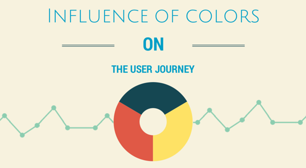
As much as web design plays its part in influencing user behavior, color is an equal contender in shaping the user’s response when they interact with your website. This can be explained through color psychology.
Color psychology is simply defined as how colors and their combinations can affect the human behavior. Although it branches from a long chain of complicated human behavioral studies, color psychology plays a significant role in determining the reaction of the human brain to different colors and their combinations. If you think about it, there have been several instances when you were influenced by colors. The green light on a traffic signal for instance, gives you the assurance that your car is safe to go, while the yellow board sign in malls helped you indicate wet floor hazards.
In an article written by Satyendra Singh, a study was conducted to find the importance of color in eCommerce website. The study showed that an average online shopper took 90 seconds to form an opinion regarding a product. Surprisingly, about 62% – 90% interaction was a result of the product color.
Below are some colors widely used in web designs due to their unique qualities that influence user behavior.
Red
Red comes among the most emotionally reactive colors that reflect love, courage and vigor. At the same time, Red also represents warning, alarm and danger. Due to these qualities, Red is an ideal color for clearing sales by adding it on CTA buttons. According to research, Red is known to raise heart rate and provoke immediate action among customers.
Green
Green is not just the easiest color for the human eye, but also a reflection of serenity and consoling. It is predominantly used in nutrition websites to highlight organic foods while giving a sense of wealth, luck, optimism and stress relief to the viewer.
Blue
Blue is no doubt one of the most prevailing colors of web design. In most websites of today, blue is popularly used due to its inherent quality to produce tranquility, trust and productivity in a web design. In other respects, it represents honor and loyalty which is why most banking websites use blue for their footers and supporting contrast colors.
Orange
Orange is the leading vibrant color that exhibits ambition and activity. It brings a dose of enthusiasm, ingenuity and promise to the customers. Due to these factors, it is widely used for Call to action buttons to attract customers and invoke their response.
Yellow
Yellow is considered a color of warning due to its use in traffic signals and wet floor signs. Even so, brands use yellow in their web designs to send signals of fun and friendliness to their visitors. Study has shown that yellow color stimulates excitement in brain that heightens up emotions within the user. Its majority use is attributed to backgrounds and Sale indications.
Pink
Pink has a long history with femininity. But aside from its womanly charm, it is a unisex color to show romance, love and calm through your web design. For young demographics of girls and women, pink is no stranger to high end marketing and featured product colors especially in cosmetics.
Purple
Purple is a color that breeds royalty, class and spirituality in the eyes of the viewer. Many top ranking websites have used this color to assure their quality standards to the visitors and create a valued feel. Purple is majorly used in clothing stores and beauty product websites for its unfeigned sensation of regality.
Black
Black color is about showing influence and power, but is also makes up for style, mystery and edification. Tones and shades are used to represent gloom, curiosity and taboo, especially on a website that contain superstitious and supernatural content. While it can raise levels of inquisitiveness, black is an excellent choice for marketing of luxury products as luxury cars, see Mercedes Benz.
White
White is the most cardinal color in the color theory. It makes up for most of the negative spacing and separates every element from each other. It also makes up for the tints used in the web design. White has a responsibility greater than any other color. It isolates elements in a website and increase readability factor. However, for white to work effectively, other color schemes must be optimized as well, so equilibrium is established between the elements of the page and the content.
Final Thoughts
Web design and colors go side by side. Without their mutual understanding, your web design can fall into chaos. By utilizing the aspects of building an elegant web design and implementing an effective color theory in your website, you can not only influence user behavior to your advantage, but also increase your store revenues in the process.
Author Bio:
Asad Ali is a competent digital marketer and running successful campaigns for the past 7 years. He has a vast exposure in promoting eCommerce website. Currently, he has heading the marketing team at Go-Gulf web development company in Dubai.


