Business website is the central point of every small business’s online marketing strategy. It is usually the point of first contact with prospective customers, so businesses naturally can’t afford to leave a bad impression there.
Still, many business owners make not one, but many mistakes on their website, costing themselves business every year. In this article, we’ll outline some of the most common of those mistakes along with some helpful suggestions on how to fix them.
Problem #1: Visitors cannot find your contact information
Your website should show your contact information prominently, so that customers don’t have to work too hard to find a way to get in touch. The more effort potential customers need to invest, the more likely they are going to leave – usually to a competitor’s website.
At the minimum, there should be a “Contact Us” page with a link in the main navigation. If telephone contact is important to your business model, put a visible phone number in the header or the footer of each page on the website, and make it a ‘click to call’ link for mobile users. Add links to your company’s social accounts as they are another good way to connect.
Take a look at this example from the Burg Bar & Grill website:

When it comes to contact email, you might decide not to show it publicly as emails tend to get misused a lot nowadays. However, you should definitely make it possible for any prospective customer to contact you by email. All you need to do is provide a contact form on the “Contact Us” page.
Problem #2: Your website isn’t mobile-friendly
Too many small business websites are still not optimized for mobile browsing. We can no longer build websites with the expectation that they’ll only be viewed on desktop devices. Today’s web audience uses a diverse set of devices from phones to tablets to even gaming consoles to browse your site, and smart watches are just around the corner.
When your website isn’t mobile-friendly, your mobile visitors will have a host of issues: the text will appear illegible, forcing users to stretch the screen and scroll it horizontally to read; the navigation will be too tiny to click, and some interstitials will get stuck and block the access to the website because their close button is out of reach, off the side of the viewing screen. Users who experience these problems are very likely to leave your website in a matter of seconds and probably won’t come back again.

Image source: www.pixabay.com
But this is only one side of the problem. Google’s search algorithm now evaluates websites based on their mobile user friendliness, so if your site isn’t accessible and readable to smartphone users, Google will penalize your ranking. As a result, your website will lose visibility and it will become increasingly difficult to find your small business online.
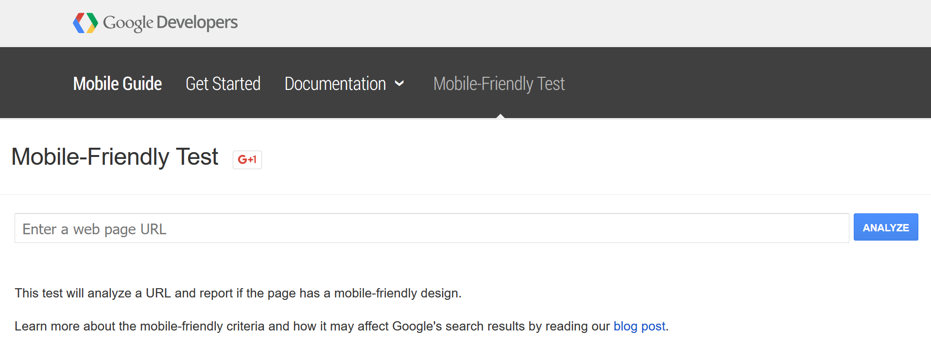
If you’re not sure whether your website is optimized for mobile or not, you can use Google’s Mobile Friendly Test to find out. All you need to do is enter the website’s URL and Google will check its layout:
Problem #3: There is no clear call-to-action
Once your website has captured the visitor’s attention, they need to know what’s next, what it is you want them to do. Otherwise, they are likely to get confused, frustrated or overwhelmed with either too many choices or a lack of any obvious choice. The fact is, when browsing the web, people don’t want to think – they want to be guided. This is accomplished with clear and actionable calls-to-action that focus their attention on the next step:

Image source: www.writtent.com
Ask yourself these questions: What do I want users to do? Do I want them to buy my product, to contact me, to subscribe to my newsletter or perhaps something else? This will help you determine the main goal of each page of your website and create a corresponding call-to-action that will help achieve those goals.
Depending on their placement on the website (homepage, product pages, company information etc.), calls-to-action should also be aligned with different stages of the purchase cycle. For example, don’t put an aggressive “Buy Now” call-to-action on a page where a first time visitor will come searching basic information about your small business.
Problem #4: Website content is not well-organized
Proper content organization is critical to keeping people on your website. And it’s definitely not achieved by putting everything your small business does on the homepage. This only creates clutter and leaves users frustrated because they can’t understand anything.
Remember that potential customers don’t understand your business as well as you do and they want to access your information quickly and easily. This means you need to make your content easily scannable for the phrases that are of interest for the users.
Break content into smaller pieces by using bullet points and bold important parts to draw the eye. Remember that people won’t read an impenetrable wall of text under any circumstances, so present your information in an engaging and simple way.
Also, keep the content in your main pages simple, defining your products and services in terms people understand and that clearly explain how it benefits them.
Here is one example of a clean and effective small business web design:

Image source: www.italiokitchen.com
Conclusion
Our take-home points are: Be accessible, make your website accessible, and make it easy on your customers to do business with you. Don’t lose sales to inefficient website design. Don’t think of your website as just a document on the web, but as your virtual salesman. Make your page a good salesman, and it will do the work for you.
Author bio:
Taylor Moore is a freelance copywriter with a passion for small business and retail marketing. For more talk on content marketing, conversion optimization, branding and customer service, follow her @taylormtweets.
When it comes to contact email, you might decide not to show it publicly as emails tend to get misused a lot nowadays. However, you should definitely make it possible for any prospective customer to contact you by email. All you need to do is provide a contact form on the “Contact Us” page.