Almost everyone today owns a website as it’s pretty easy to get running with it. But, just because you have a live website doesn’t necessarily mean that its design is optimized to suit the modern user.
Did you know that it takes only 0.05 seconds for people to form an opinion about your website and that too by its design? Yes, that’s right, just 50 milliseconds! With that being said, you can already imagine how significant the impact of website design is hence, you must get started with putting your best foot forward.
Although no website is perfect, your ultimate goal should be to make your website as optimized as possible. Some important considerations of website design as suggested by Frederick MD experts, include design, layout, UX, and others alike. There are a lot more factors apart from these which are detrimental to the success of your website be it anywhere. But, if you follow the best practices mentioned below, the performance of your site will drastically improve. So, get started already!
Choose a brand compliant colour scheme
Almost 90% of product judgements today are made on the basis of colors. Astonishing, isn’t it? Well, keeping this in mind you must choose a colour scheme which goes along the same lines as branding. Refer to your brand logo and analyse if the colours of your website fit with your brand image. It is known that colours increase brand recognition capability and your audience is easily able to associate with the brand. By keeping things consistent, there is no confusion.
Show, don’t explain
Firstly, stop filling your website homepage and landing page with too much text. Learn to explain your big story in a few sentences as this is what will engage your audience.
Secondly, instead of explaining things to your target audience, show them. They will understand well in a shorter time span. For the same, Orange County Web Design recommends adding visuals as the way to go because they not only break the continuity of text but also provide a deeper explanation regarding what you wish to convey.
Make your CTA clear and obvious
One of the most important elements of any web page is the CTA. They need to be big, bold, and powerful such that they attract the attention of the target audience in just a glance. As it is, there’s no way you can drive conversions without an effective CTA button.
In addition, there are businesses which don’t have a CTA button on their interior pages. And, this is one of the major design flaws. Don’t expect your visitors to navigate back to your home page and convert hence, providing a clear, action-oriented CTA is essential.
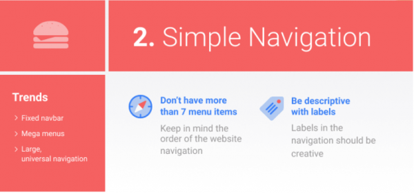
Simplify navigation
If it’s difficult for the visitor to find what they’re looking for, they are likely to leave instantly. And, there’s already too much competition in every industry today. They leave your site only to find the same product elsewhere. So, it is suggested not to reinvent the wheel with something complex. Instead, stick to the basic website format as it is easier to follow.
Reinforce actions with familiarity
So, you’re the owner of an ecommerce website. Think of how people will navigate on your site in case of a different CTA on each page.They will first browse on the page for a bit however this doesn’t mean it will convert. Only if the same CTA button is available for the user on the home page, product page, and category page, there will be reinforcement and your user will be your prospect. So, make sure that if your message is the same, so should your CTA, on every single page of your website.
Prioritize SEO
93% of all internet experiences start with a search engine. So, it is extremely crucial to implement mobile-friendly and search engine friendly websites. Failure to do so will put your competitors to an advantage. Hence, your search engine optimization strategy must go far beyond just adding keywords to your blog posts.
Apart on on-site optimization, create an XML sitemap as it will make it easier for search engine crawlers to analyze content on your website. A sitemap will show bots the location of pages on your website, when it was last updated, the updating frequency, and relationship to other pages on your site.
When you’re designing your site, make sure that its architecture has a logical hierarchy as well.
That’s pretty much all. Follow these best practices today if you want your website to stand out!
