Beauty is all-compassing. One finds it everywhere, every culture or people on this planet cherish it. Beautiful writing is also included in that fascination with everything pretty, curved, and symmetrical. One might even argue that it, calligraphy, encapsulated beauty better than anything else. The history of calligraphy is a long and diverse one, with it being a much-appreciated art on every continent.
When one thinks of calligraphy, one usually think of East Asian or European calligraphy from the middle ages, as well as Muslim influences on this art in the same period. That means that the majority of Calligraphy Fonts feature shapes and forms that have been mostly used in those areas during the middle ages.
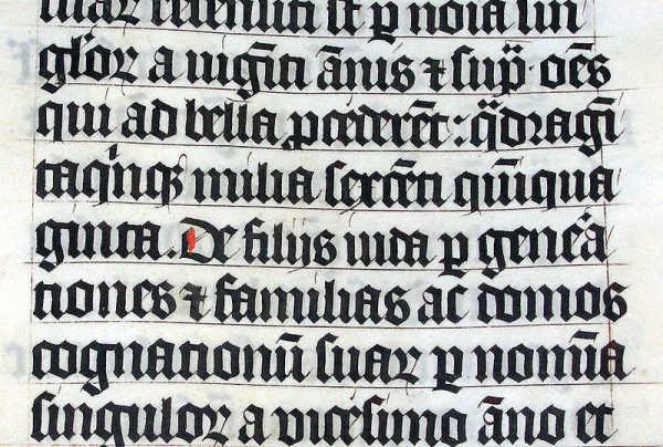
Calligraphy in Europe started with the Greeks and Romans almost half a century before the birth of Jesus Christ. But during the fall of both the Roman Empire and greek culture with it, Europe descended into the dark ages, where many arts, calligraphy included were almost forgotten. But some parts of the empire kept honing this practice and art. In most cases, they were priests who tried to copy the text of the Bible or translate it from Greek or Hebrew back to their native languages. In the beginning, the calligraphy fonts that hey used were more square, but gradually with time, they started to form more lavish curvy forms. One of the better examples is the Georgian calligraphy translations during the 14th century, which feature thin and roundly shaped letters. There is also a big difference between the Latin and Slavic calligraphy schools in Europe.
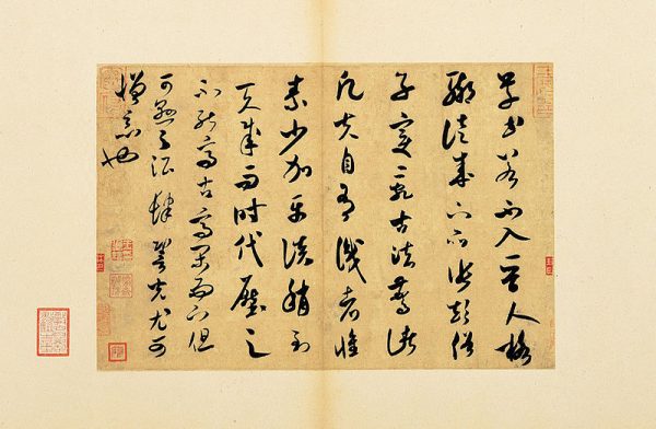
In East Asia, China was the hub that started it all. Later this art moved throughout the continent. Some countries, like Japan or Korea, still hold this art form near and dear to their hearts, with traditional schools that teach it to younger audiences. There are also many famous masters and exhibitions throughout eastern Asia. Chinese are known to use the Four Treasures of the study. Those are four distinct brushes with which they write down their symbols or letters. They also use very specific types of inkstone, ink, and paper, knowns as the Friends of the Study. Both the Japanese and Korean schools of calligraphy have been greatly influenced by this approach to calligraphy.
The beginning of the 20th century saw a big boom of popularity for calligraphy once again. Edward Johnston was at the forefront of the new revolution and is hailed as the father of modern western calligraphy. Many modern software developers, especially those who work with Microsoft Word, are truly in debt to this man, for his inventiveness, creativity, and flair. It was him who showed that writing could be more than just putting your usual letters on a blank sheet of white paper.
The need for Calligraphy fonts is as large today as it ever was. Calligraphy has an air of classiness, style about itself. This makes it very valuable for a wide variety of people. If you have bad handwriting but want to craft a letter of congratulation to someone you hold dear look no further than one of the ideal fonts shaped in the style of calligraphy. For example, you could go with Great Vibes or The Queen. Both have distinct big first letters. They are both designed to mimic exquisite cursive writing, reserved for the upper echelon of the classy and educated. They are also well suited for flashy, well thought out titles or subtitles for your blog, articles or books. But they also look great when you combine them with other fonts. We would recommend that you use Great Vibes with Open Sans or Roboto for a strikingly dynamic parring.
Fonts like that of Arizona can give you a unique design twist that will set your post apart from every other one finds online. It combines the best of both the European with its bold like letters, with the curvature of a more Arabian twist.
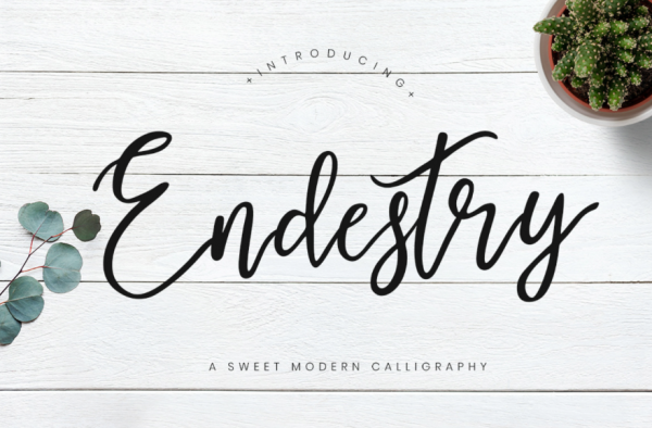
Or, in the case that you look for something that really pops, you can use Endestry as your desired font. It has wonderful, flowing cursive letters, that are like a million rivers crossing in and out of each other.
Calligraphy has had many ups and downs throughout the years, but with the many new fonts, it is sure to stay.