The ecommerce industry’s popularity has skyrocketed to the high-heavens. Considering how inclined people have become to online shopping, it’s no surprise that the industry has grown to nauseous heights. However, even having said that, growing a successful ecommerce store isn’t exactly easy. Not only would you have to deal with cutthroat competition, but it has also become more challenging to convince your audience to buy from you. If you can relate to that sentiment, and you’ve racked your brains out on how to close more sales — but you remain unsuccessful, then you’re in the right place. In this guide, we’re going to talk about several elements that your ecommerce website needs so you can convert your web visitors into paying customers.
Let’s hop right in.

(Image Source: Pixabay)
1. Add product reviews and ratings
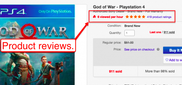
Product reviews are great because they pretty much put your customers’ minds at ease about making the purchase. The idea is, if others are happy with the product (as shown in the ratings and reviews), then they will most likely experience the same thing. Product reviews are so crucial, that ginormous ecommerce stores are adding ‘em into their product pages.
Check out eBay’s product page.
And here’s Amazon.
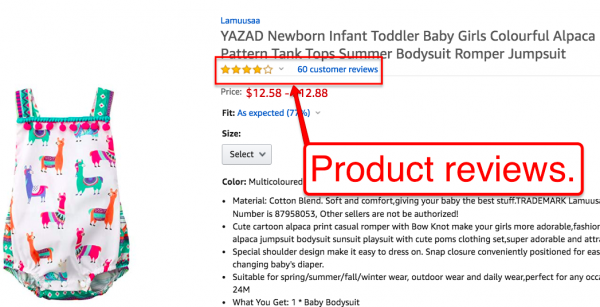
Did you notice how the product reviews and ratings are directly below the product title? (For both Amazon and eBay, at that?)
Those aren’t placed there in random. These massive ecommerce stores spent thousands of dollars split testing their product pages’ layout and elements so they can come up with the perfect layout to compel their customers to take out their wallets.
If you want to get more sales, then follow their lead. Add a product rating/review element in your product pages, and add them directly below your product titles.
2. Professional-looking logo
Since trust is an essential component to closing a sale, your site needs to look trustworthy. Otherwise, your would-be customers would only take your website as a sham, created for the purpose of tricking them into giving their credit card info. You’ll never succeed in the ecommerce space if you don’t win your audiences’ trust. That is why you need to make your website’s “profile picture” look trustworthy. Some would say that everything that’s above the fold of your website is your site’s “profile picture,” others say it’s your logo.
I, on the other hand, would argue that it can be both.
Why risk one over the other when you can make both elements looks stunning so you can win over your customers’ trust. Besides, to have a standout logo, you don’t have to spend bajillions of dollars.
You can go to logo design marketplaces like LogoMyWay to run logo design contests. By doing so, you’ll have several seasoned logo designers work on your logo even without you having to pay thousands of dollars for it. You’ll only pay for the prize money and the listing fee — you are not required to pay every single designer who worked on your logo.
Pretty awesome, isn’t it?
When working with logo designers, remember to consider these:
- Talk about the emotions that you want to invoke from the readers when looking at your logo. (e.g., power, authority, fun, weird, etc.)
- Mention your target audience.
- Mention what your business is about.
- Even tell them what your preferred color combinations are.
- If your site is already built, then share the link to your site so they can align their logo’s overall feel to your existing website.
3. Optimized “Above the Fold” website content
Now that you know how (or where) to find stunning logos for your ecommerce website, it’s time we talk about your website’s “above the fold.”
If you’re quite new to the term, the website’s “above the fold” content is basically the first thing you’d see on the website when the page loads, without you scrolling.
As you can probably imagine, that bit is crucial since it has the capacity to tell your audience that you have what they’re looking for, or, turn them off to the point of them clicking away because of how poorly crafted your site’s “above the fold” is.
The good news is, creating an “above the fold” content that’s optimized for conversion isn’t rocket science, at all.
One of the things you can do is to make your sliders less overwhelming.
Check out what Patpat.com did to their Homepage. They only focused on one call-to-action per slide.
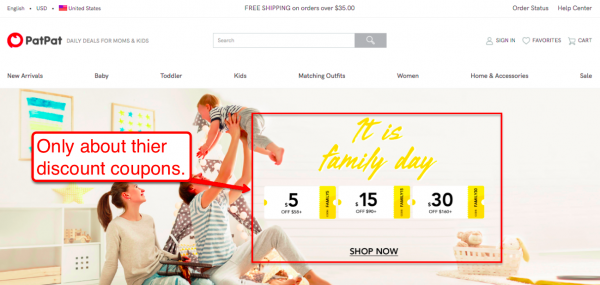
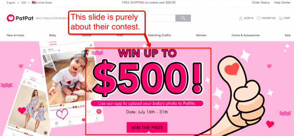
And since their slides make up the majority of their “above the fold” real estate, their customers aren’t overwhelmed with all the elements since their attention is only directed to a single call-to-action.
Here are several other pointers to optimize your website’s “above the fold” section:
- Make your phone number (or other contact info) visible.
- Make your website navigation clear and intuitive. Give your audience the shortest route to the product category they’re looking when looking for them on your homepage.
- Add a search box.
- Add a “Favorites” feature
4. Laser-focused product pages
By “laser-focused,” I’m talking about your page being laser-focused about what it’s created to do — to sell.
Not to get shares.
Not to get comments.
Not to get likes.
But, to sell.
Your product pages’ goal is to close the sale. (You can pursue shares, comments, and reviews after your customers complete their purchase.)
That being said, be sure to align everything in your product page to that one call-to-action, “Buy Now.”
Make sure that your content is compelling. That it talks about your audiences’ pain points, transition by telling them that your product is the solution to their problems, then ask your readers to click your “Buy Now” button.
Your product photos should also be of good high-quality, one that can compel your audience to click your “Buy Now” buttons.
Even the customer testimonials or reviews you’ll highlight should compel your audience to buy.
What’s next?
Make no mistake, the points I listed are far from being complete.
If you’ve been in the ecommerce space for years, you’d know that an entire book can be written about the topic of creating a high-converting ecommerce store. (Volumes of books, even.)
However, I’d like to point out that while the points certainly aren’t complete, if you follow them, you are bound to see positive results out of your ecommerce website.
Feel free to comment below with the best tip or strategy you’re using to get more ecommerce sales.

