Increasingly, knowledge about the user experience has become a key element for digital strategies to deliver the expected results. Thinking in this context, this post tells you everything about UX design platform so you stay on top of everything you need to know about UX design. Check it!
What is UX design?
The term UX Design comes from English (User experience Design), and deals with the discipline that helps to design or design the user experience.
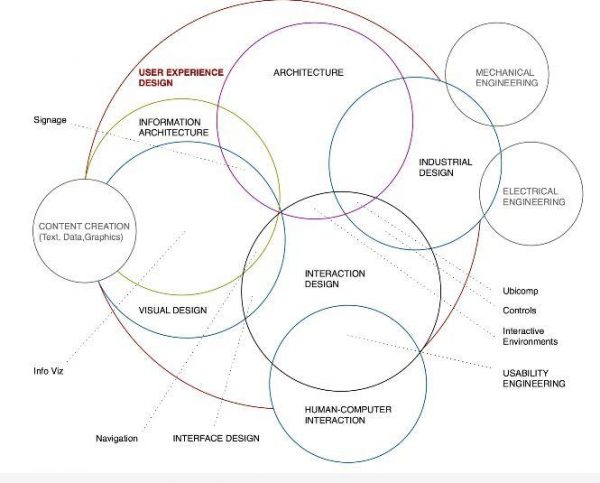
There is no person responsible for “doing UX”, or “doing the UX of the site”, “doing the UX of the app”. A good user experience (such a UX) is a sum of several factors, an easy-to-understand flow, a pleasing visual, clear and concise texts, good usability, light load pages, simple steps, a site that works on any platform or device, etc. and there is scarcely a single person who stands responsible for all of this. A good UX is the sum of the work of various professionals: visual designers, programmers, copywriters, motion designers, creative directors. Obviously, the work of a project manager, who coordinates all these activities and manages the time of all team members.
First of all, we need to know what user experience is, which is nothing more than the level of consumer satisfaction when using any system or product. Within this scope, there is user experience design, or UX design, which is a more specific area responsible for the aspects of interaction of this consumer with this system or product, such as aesthetic and visual appeal, diagramming and information architecture.
The main purpose of user experience design (UX design) is to make the customer’s experience with the brand memorable. That way, the more effective the UX design, the more users’ needs will be met and, consequently, the more satisfied they will be. For example, when a blind person uses a specially programmed system to make it easier to read because of his condition, he will feel much more motivated to continue or return to his site.
What is the difference between UX design and UI design?
Although these terms have a symbiotic relationship, in which both benefit each other to achieve their goals, they have very different approaches. While UX design is related to the client’s emotional side, that is, how it will behave to use a particular digital platform, UI design is related to the environment through which the user controls and interacts with that platform.
For example, the user interacts with a particular device using menus or buttons. Therefore, user interface design (UI design) is the means by which that user will achieve their user experience.
Why is UX design important?
Imagine the following situation: you have carefully planned your online store and it is time to put it on the air. However, you neglected to hire a designer who understands UX and your site came out a real mess, with no visual character and the information all truncated. So, do you really think it will attract or retain a customer? Definitely not. Therefore, it is very important that your system or product has undergone a complete user experience design process, so that the needs of these customers are met.
A real user experience is to go beyond finding the best solution to the problem to take into account factors such as accessibility, usability, utility, perception and efficiency, in a way that defines what, for whom and how Problem will be solved in order to prevail the user’s easy understanding and satisfaction when using a particular system or product.
How to sell more with UX design
In short, we can say that UI is the means to achieve a result, which is UX. The name says it all: the experience is the user, but the interface is the responsibility of the company that develops. Although each one defines its parameters, successful websites follow more or less the same recipe. The more they follow these patterns, the more users learn to navigate those sites and “unlearn” to navigate any other confusing site.
Let’s not get caught up in technical terms, okay? We list below the top tips of UX design that you can perceive even without knowing the subject in depth and, who knows, applying this new knowledge to your virtual store?
First Scroll
The first scroll concept has been applied to many websites. It works like this: when a user enters a page, the information of the home page appears in blocks of equal sizes. The first block usually has full resolution on the entire browser screen with the main information “condensed” without the user having to scroll.
An expression that can be applied to the first scroll rule is “the first impression is the one that stays”. In the services segment, it is common to see a value proposition accompanied by a call to action and a simple or generic image that does not disturb the verbal language.
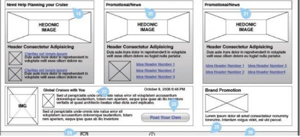
Already in the e-commerce, the first scroll on the home page is usually a large banner alone or accompanied by three other banners just below with promotions and product selections. Even if you do not know what UX design or UI design is, you may notice that different sites follow more or less the same structure and you do not realize it. This explains why you can navigate on most of the pages you visit and why you get annoyed at other sites that are out of the way. But all this begins with the creation of a wireframe.
What is a wireframe?
Wireframe is a technical drawing, usually done by information architects or UX Designers. It is a design of the site structure that aims to show the ways in which the pages can lead and to design a layout for each page, thinking about the standardization and usability, based on the user behavior data available in Analytics and other tools for e-commerce that provide interesting information about the behavior of your visitors, such as heat maps.
After the analysis, it is up to the UI designer to elaborate the images and the banners that will compose each of the pages.
Lead Capture
Another common point among e-commerce is the opening of a pop-up after a period when the user has the site open in a flip, but is inactive. The pop-up serves to stimulate the immediate conversion of new customers and generate registrations for the contact base. It is generally only displayed on desktop versions because of Google’s penalties for sites that use pop-ups on the mobile and impair usability because the screen is too small.
Bottom bar
Means of payment, social networks and institutional information usually stick to the bottom bar of the site. The consumer is already conditioned to know that this information is posted there, no matter what page of the site they are on. They serve to make it easier to navigate and inform the customer of contact information and payment and security information without having to change pages, which could undermine the conversion rate.
Top bar
Like the lower bar, the top bar is fixed and concentrates the categories of products of your store, the logo and the access area restricted to the user – account and cart. In this way, the visitor can navigate between all their departments without having to return to the homepage every time.
Usability
All these features of a website have to be thought from the mobile version. The concept of “mobile first” is real, it is no longer one of those terms that come and go. Proof of this is the E-bit Webshoppers survey: in 2015, 15% of sales were made by mobile devices, and the trend is for those numbers to increase year after year. Among younger users it is already more common to use Snapchat, Instagram, Whatsapp, and applications developed especially for mobile than Facebook.
What does an UX Analyst do?
So what experience are we talking about here? Simple: one that a user has when interacting with their product or service, be it physical (such as coffee and chairs) or digital (such as a website or blog). With this in mind we can say that the UX Analyst is the subject that will study, plan, prototype and conduct tests and research with users in order to produce the best product for a particular company.
The true user experience goes far beyond just providing customers with what they say they want, and it’s necessary to make them happy to own your product and happy to use it. In this way, to work with UX, it is necessary for the designer to study and evaluate how users feel about a system, taking into account aspects such as ease of use, perception of system value, utility, efficiency in performing tasks and other characteristics to propose the best solution to a given problem. It is also necessary for UX Designer to have a broad view of all the disciplines that are involves in it.
Author Bio:
Sarah Feldman is currently working as a Marketing Manager for Digital Express, a UI/UX Design Company in Dubai. She loves to write about latest trends Graphics and Website Design.


2 Comments
David
24 August, 2017Nice post! Thanks for sharing.
Phillip W
24 August, 2017Really nice 101 piece on UX, appreciate the share.