In the world of arts and creativity, it is not necessary that everyone is creative. It is a fact that to get success in the design world, creativity is a mandatory factor. But still there are lots of cases exist in which designers are not creative and the masterpiece designed by them considered to be worse. Let’s talk about logo. A logo is the main identity of your brand which should be simple and creative. It is that small thing that sticks in the mind of the audience. But if it is designed complex or with any other serious misstep which is even noticed by the audience, it means that the design is out of creativity and the designer’s mind is empty from out of the box ideas.
Here, some examples are being explained how inaccuracy and lake of creativity in the logo design ruin the overall reputation of your brand. It is just the fault of designers who didn’t think about creativity.
KidsExchange
KidsExchange is a famous consignment sale website. Although, the company has a good reputation in the market but if you look into their brand identity (logo) then you will find some serious missteps. The notable mistakes are the lack of proper capitalization and un-balanced spacing between the words. A creative designer can easily understand these mistakes while viewing the logo.
MegaFlicks
The viewers seriously think twice while entering into the Mega Flicks store due to its font. In the graphic design, a term is used which is called “kerning”. It is basically a process in which the designer adjusts the spaces between the text written in the logo or any other graphical feature. So, the designer who created this logo may be forgot the rules of kerning. As a result, the brand name becomes “something else”. So, it is a big blunder and designers should carefully choose the fonts while designing a logo.
Arlington Pediatric Center
Arlington Pediatric Center provides some wonderful physicians and health care to the children through 18 years of age. But if you view its logo then you definitely misperceive its services. The logo is so tragic and viewers get wrong perception about the medical center. Designer of that logo did definitely not keep in mind about the creativity, concepts and nature of business while creating it.
Instituto de Estudos Orientais
Instituto de Estudos Orientais is a Brazilian university that promotes its center of oriental studies. Basically the concept its logo was to portray the sun behind a yellow building. But the designer of the logo used simple black lines to represent the roof of the building which went weird. Majority of people adopt wrong concept while viewing this logo.
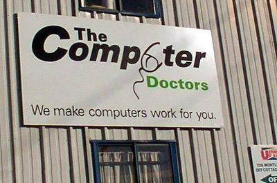
The Computer Doctors
The logo of that company is not so much bad. But, the mouse created in that logo in such a way that it is representing something “different”. So, the logo of Computer Doctors is considered to be one of the most disastrous logos of all time. I think the designer should have worked more on the mouse of that logo. The idea is no doubt creative but the mouse is looking so weird and people take wrong perception while viewing that mouse.
Author’s Bio:
Emily Ben started her professional career as freelance digital marketing analyst in 2015. For 2 years, she proved herself as one of the top digital marketing experts in UK. Currently she is working with Crafted Logo, one of the most rofessional logo design services in the world.


