You may have heard that it takes only five seconds before a visitor decides to leave a website, so you essentially need to entice them to stay during this time. It’s a sure challenge, but if users are leaving your website in a jiffy, it may be time to make particular changes that can enhance your retention rate. There are some major ways you can optimise your website, of course. Still, there are certain things you can already do to improve your website’s functionality and the overall experience of your visitors. Making updates to your website doesn’t have to be too complicated, so here are the best concrete steps you can take to improve your website today.

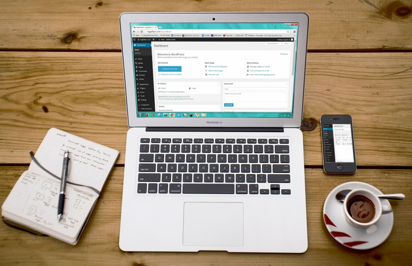
Image source: Pixabay.com
1. Come up with a plan
It wouldn’t do to be disorganised when you’re improving your website, so the first step is to come up with a plan. What you can do first is map your visitors’ journey from the time they land on your site to the time they become actual customers. Consider the web pages they will be viewing, the content they are likely to read, and the offers they may decide to act upon. Once you understand this, it will be easier for you to create a website that promotes leads.
2. Remove distracting elements
There may well be certain elements on your site that don’t help you – and these distracting elements can turn away potential customers from the get-go. These include complex animations plus lengthy content and stocky or bulky images that take up too much space. The thing is, you have to be as straightforward as possible once a visitor lands on your pages, and your design should accentuate what you are trying to achieve on a particular page.
It’s crucial to be consistent with your brand across your pages, and you should plan your colours, images, font styles, and iconography accordingly, as web design Cheshire professionals from It’sEeze attest. Even your logo use will make a difference. It’s essential to avoid too many interactions or page animations – too many pulsing buttons or icons can detract from your message and distract your users, leaving them more confused! Here’s a tip: when choosing fonts, make sure they are in the same family, regardless if they are bolded, medium, or light. It makes your site look more uniform and blends everything more seamlessly.
3. Improve your calls to action
As soon as someone visits your site, guide them to see the pages that can nurture their conversion. Make it easy for visitors and point them in the proper direction. The last thing you need is visitors leaving just because they can’t find what they require – and one singular way you can help them is to improve your calls to action. It’s best to be strategic with your calls to action, and you can do this by placing your calls to action at the topmost right-hand corner of your site’s navigation bar, underneath sections that request for action, and at the bottom of site pages. But it’s also worth remembering that you shouldn’t overwhelm your visitors with too many calls to action. If they’re at your site trying to educate themselves about something, it’s better to give them the content they need – such as a detailed guide or an FAQ page.