Would you believe if we told you that the color scheme of your brand has a significant impact on the end-result of the company? Well, it does. According to branding statistics, 90% of purchasing decisions are under the influence of visual factors. After all, we are visual creatures, and our decision-making process is often based on emotions.
So how can you harness this information? Can a simple color change affect your business? Read on to find out.
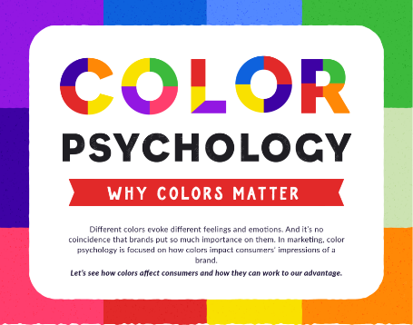
The Fascinating World of Color Psychology
Colors are a fascinating phenomenon, and the properties of colors are equally impressive. In the recent period, studies have provided us with in-depth knowledge of how colors affect our mental state.
Even though some of the conclusions should be taken with a pinch of salt, it is easy to see that some colors tend to evoke specific feelings and emotions.
Of course, it all depends on the person in question. Not everyone will show the same reaction to the same color. That is why every marketer and business owner should test the color scheme before launching the product.
Either way, the conclusion we can draw from color psychology is that humans make a subconscious judgment when they see a particular color.
In other words, some colors arouse emotions and feelings that could entice the customers to buy a product or sign up for a service.
Why Are Colors Essential for Branding?
If you are on the verge of starting a brand, you probably hear a lot of advice on the importance of “standing out from the crowd.” Yes, experts agree that you should always try to cut through the noise and be noticeable.
Well, colors can help you with this task.
By choosing the appropriate color scheme for your brand, you will establish a brand identity. The importance of identity should never be underestimated in this day and age. What this means is that you need to boost brand awareness as much as possible. The perfect way to do so is by using a consistent color scheme through all of your visuals.
To be precise, your dominant color should never change, and it should be easily noticeable in your logo or social media posts.
That said, here are the most prominent features of the five most popular colors. Make sure to learn all there is to know about these characteristics before deciding on your primary color.
Blue
It is not a coincidence that some of the biggest brands in the world have blue as the dominant color. Take a look at the color scheme of companies such as Facebook, Twitter, or LinkedIn.
The reason for this is simple – blue is by far the most popular color in the world. It evokes feelings of trust and serenity, and it has a calming effect. Blue can also boost your concentration and soothe anxiety.
At the same time, some people “accuse” blue for being cold and emotionless.
Red
Red stands on the opposite side of the spectrum in comparison to blue. As such, this color conveys feelings of excitement and raw energy. In essence, brands that rely on red want to show their dominance and confidence.
Yet, some people perceive red as an aggressive color. In any case, it gets the pulse racing. That said, make sure that you know what you are doing if you go for this color as your brand identity.
Yellow
Yellow will also give you an energy boost, just without the fiery aspect that comes with the red. In other words, yellow is the color of optimism and joy. If the tone is mellow and subdue, yellow can also be an emotional color.
Even though some people associate fear and fragility with yellow, this color is easy to spot. As such, it works great in combination with other colors. (Think of IKEA logo).
Green
As the color of peace and harmony, green is a laid-back type of color. As a rule of thumb, companies that deal with agriculture will go for green as their dominant color. But this is not a rule set in stone.
For instance, some people think of green as an uninspiring color. On top of that, brands should know that this color can be associated with greed as well.
Gray
In the end, let’s mention the dullest color of them all. Yes, no matter how many shades of gray you use, this color will look neutral. In essence, gray tends to show a lack of confidence. Then again, luxury brands sometimes decide to go with gray as their color of choice. In combination with black, gray can do wonders for high-end brands.
How to Pick the Appropriate Color for Your Business
As you can see, there is more than meets the eye when it comes to colors and logos. Thus, you should pay attention to the dominant color of the brand if you want the business to grow. The best course of action is to determine the type of company and the direction of your brand before doing anything else.
Once you establish the general idea of the brand, you can customize the logo and choose the color scheme. The crucial thing is to select the colors that follow the primary concept of the brand itself.

![How Can a Simple Color Change Affect Your Business? [Infographic]](https://technofaq.org/wp-content/uploads/2020/06/looking-digital-marketing-aftermath-lockdown-top-dos-donts-revealed-opace-150x150.png)
![How Can a Simple Color Change Affect Your Business? [Infographic]](https://technofaq.org/wp-content/uploads/2020/06/word-image-28-150x150.jpg)