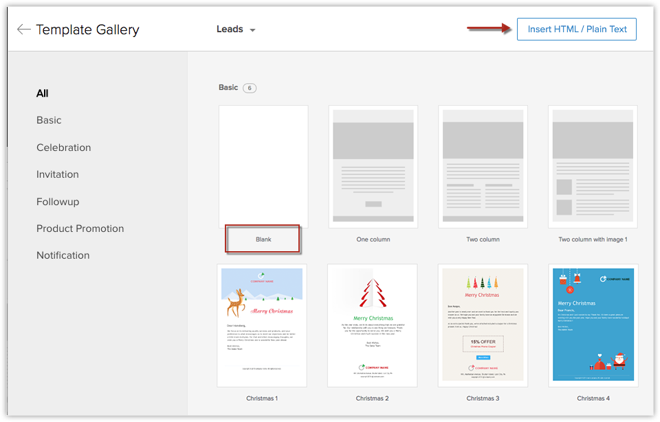
Making email templates for your marketing campaign can make your life a lot easier. All you have to do is write your email copy, add a few images and a call to action. After that, you have an email that’s ready to go.
To help make your emailing campaign simple, we’ve compiled a list of tips to help you. Also, you should send your email through a Litmus test and a second set of eyes to see how optimized your web design is.
Use the Correct Coding Software
What separates a bad website from a good one? The utilization of the coding software. That is to say; you shouldn’t use Microsoft Word to write up your template code. WYSIWYG editors will add bonus codes which can make your emails rather wonky in design.
To solve this problem, you should use Notepad (comes installed with your computer), Dreamweaver, or HubSpot’s template creator. This software helps you create your email templates faster and more efficiently.
Don’t Forget the Tables
Tables are great for giving the numerical facts to your audience in a clear and concise manner. In fact, we’d state that you use tables when designing your email templates. This will keep your readers interested in your story and gives their eyes something to read more than just a wall of text.
When coding it, make sure that your tables render through all of your email clients. By doing this, have a crisp design across every email platform.
Forget Using HTML Bullet Points
The number one killer to your email campaign is bad design. Ad using HTML bullet points is a bad option because it doesn’t render correctly in email form. That’s why you should use asterisks (*) or dashes (-) to make sure that your readers don’t see any missing or broken bullets in their inbox.
No PNGs Needed
The file type of your images will determine the quality of your email templates. Avoid using PNG file types because they aren’t supported by lotus notes. The best file types for your campaign are JPEG and GIF photos. They will render perfectly and will help make your emails more interesting to your audience.
Use The Right Amount of Images in the Right Size
Having too many images will detract your audience to what you’re selling. The same goes for having only a few images on your campaign.
As a rule of thumb, it’s best to have a smaller image file size. Having large files will increase the file size of your campaign and might be unreadable for your audience to view your email. Make sure that you have an even amount of images and text. This will increase your reader engagement and keep your emails out of your reader’s SPAM folders.
Conclusion
To conclude, your email templates must be tailored to reach your audience correctly. By taking time to check for small mistakes in the copy, images, and overall design, you’ll be able to make your campaigns more effective.
Are there any additional questions that you have about making a good email template?
Tell us in the comments below.
Sources:


1 Comment
James
21 June, 2018The best point you’ve shared here is that the email must definitely be tailored correctly to whoever you are sending it to. However a good template will definitely you save time. So thank you for sharing these tips!