Typography is one of the most imperative attributes of the content. Through typography, the business runners can exhibit everything about the business on the website with the utmost ease. Indeed, it plays a crucial role in designing the content layout.
Typography is a genesis of good website design. Even, it can make the content conversion-centric. As the competition in the digital landscape is on the rise, everyone is looking for the way to deploy the alluring website design that can grab the attention of the visitors at a first sight and ensure a pleasing experience while they are reading the content.
Being a key component of the website design, it is not easier for the website designer to deploy the effective typography that can boost the prospect of the website and enhance the conversion rate. Thus, this blogs presents the list of renowned websites that are using typography in the best manner. The designers can learn the significant features and can use those features in their typography designs.
Have A Quick Glance Over The Examples:
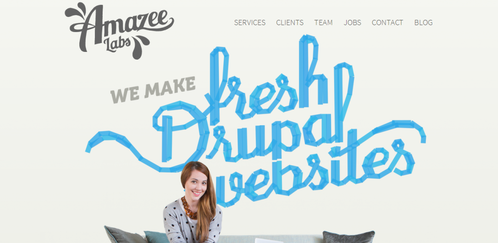
Amazee Labs’s website is packed with the extremely beautiful and alluring typography that has the potential to regale the visitors and make them access the website again and again. Along with this, the content seems readable as well as attention-grabbing. The style of font sheds light on the content so that the visitors will love to explore different pages of the website.
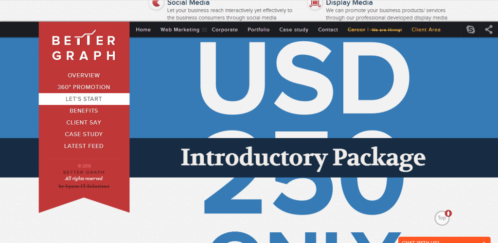
BetterGraph website comes bestowed with aesthetic typography that presents a lot of information about the products and services in a brilliant manner. The incredible styling attributes are used. The typography is superbly deployed to render a beautiful user experience to the visitors across all the devices.
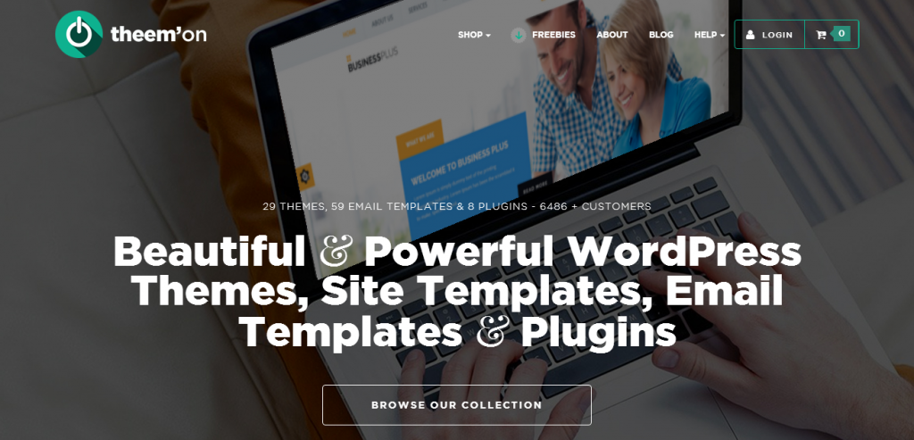
theem’on features amazing typography for their content. The layout of the typography is superb. The large size and superb font type on the top of page reflect the imperative information about the services brilliantly. Along with this, the typography of the content matches aesthetically with website layout. In fact, it has embellished the website beautifully.
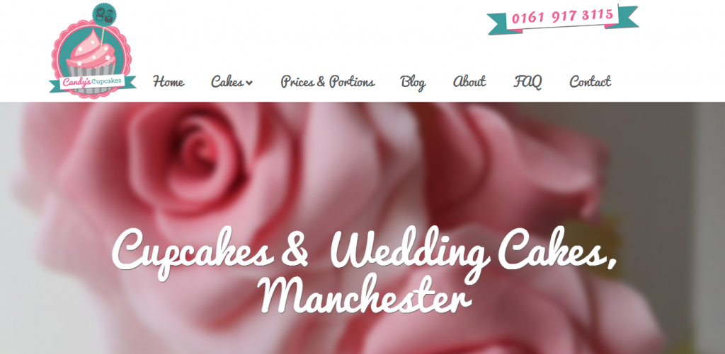
The website of the Candyscupcakes comes with a beautiful typography that has made the website seems astonishing. Along with this, the style attribute of the font is alluring and persuasive.
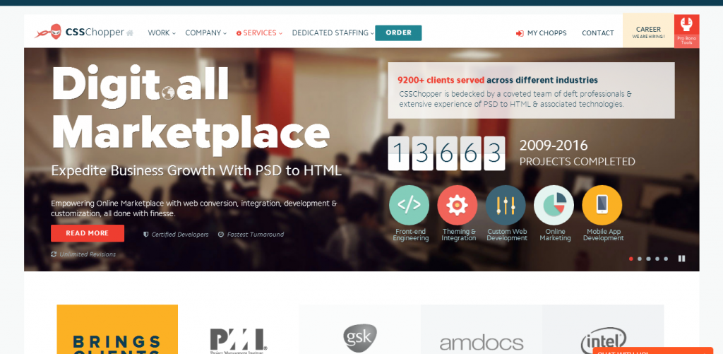
CSSChopper website design features large-sized typography that has been designed according to the varied pages. The best thing of this website is it exhibits everything about the business in a beautiful way. The style attribute is simple and influential. More importantly, it is easier for the visitors to understand what the website page accentuates about the business.
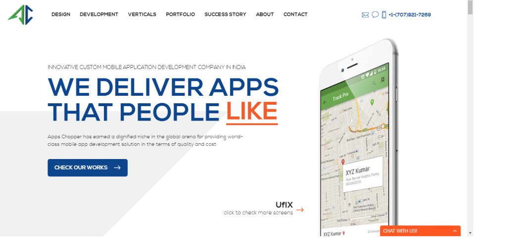
For a well-structured layout with beautiful typography, AppsChopper’s website is considered to be the best. From readability to design, every aspect of typography is superb. It has the capability to attract the readers and keep them engaged well with the website page. The most important thing is its simplicity and fabulous pattern that describe everything about business services in the best manner.
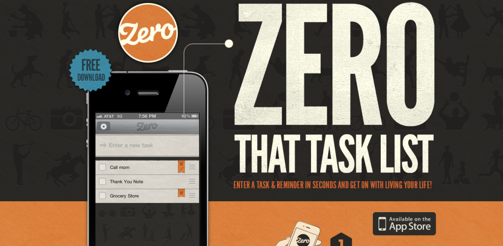
Zero comes with the amazing typography that accentuates everything about the application in a beautiful manner. From font size to font color, every attribute is brilliantly deployed in the website so that the visitors can easily understand the content of the business website. The background and style of font are amazingly used to give a unique design to the layout.
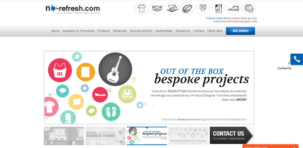
Renowned for providing the online designing tool for different businesses, No-refresh website features astonishing styling for the content. The layout of the website seems aesthetic with the website design. The content of the website seems readable and impressive. This is the reason that the bounce rate of the website is nil or extremely low.
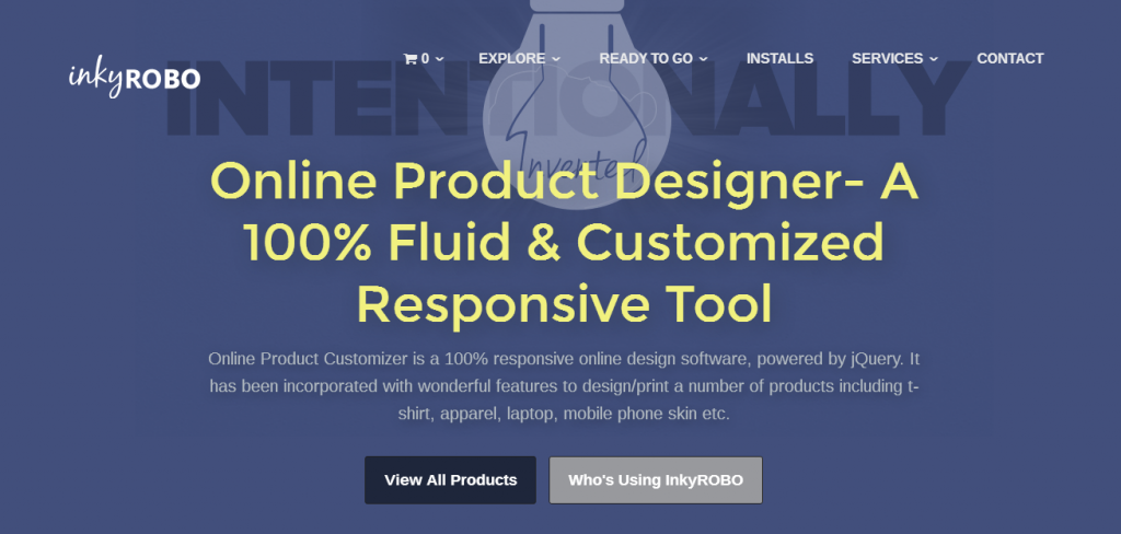
The website of inkyROBO comes with astonishing typography. It brilliantly exhibits the content and ensures the best readable experience to the visitors. The font size, style and color are superbly used to accentuate the content perfectly. The typography of the content matches well with the website layout. For designing the logo, they have used the best typography.
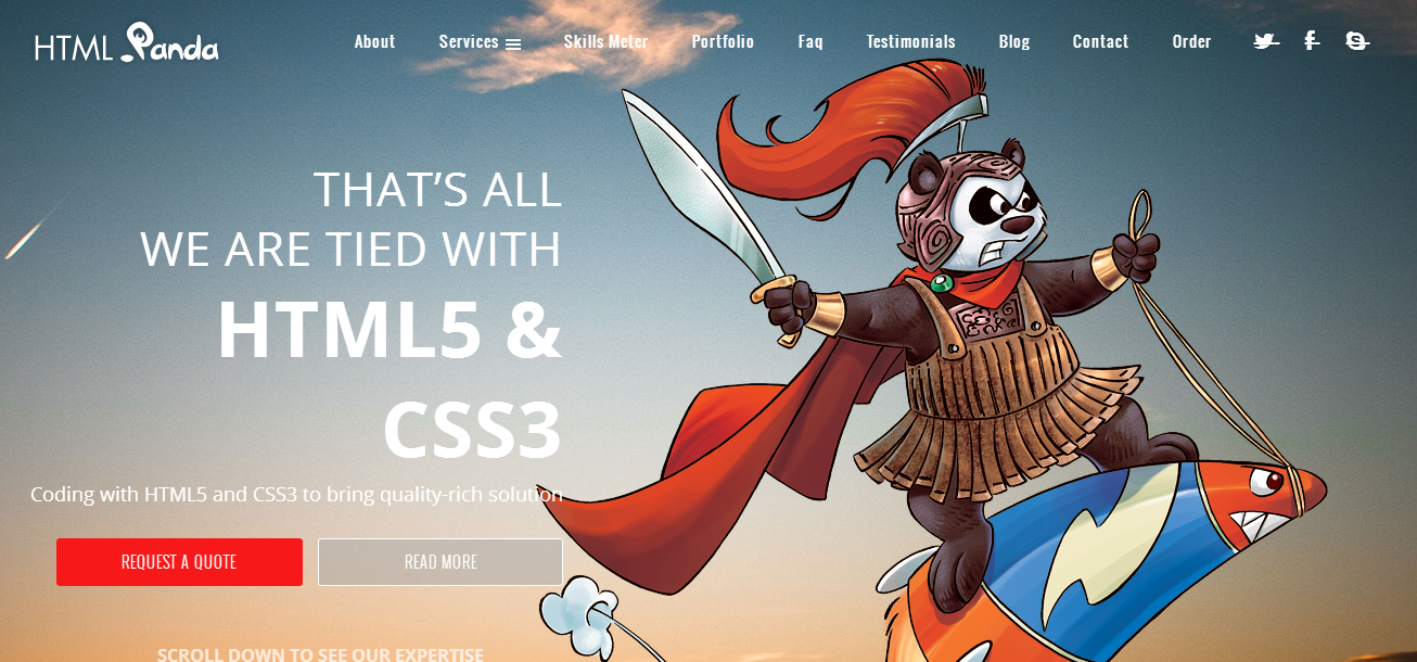
HTMLPanda has brilliantly utilized typography as an instrument to make the layout of the website more alluring that can gain the attention of the visitors at a first sight. It never distracts the end-users and ensures a better experience related to reading the content. In a nutshell, it is conversion-centric that can inspire the visitors to carry out the desired task at ease.
The Bottom Line
Typography is a key ingredient of all websites’ layouts. And, it is now become a website design trend. Moreover, it has the capability to make the layout stunning. Hopefully, this list of the websites will be helpful in sparking some new ideas related to deploying typography for your own website. If you want to share your views regarding this blog, you are most welcome to write to us via the comment section given below.
Author Bio:
Steven Bowen has been associated with Webgranth for many years. He is a passionate blogger and likes to contribute the informative knowledge regarding contemporary website development technology, trending online printing solution, developing mobile website and many more. His remarkable content has sorted out common dilemma related to web designing and other concepts.



1 Comment
Nishant Desai
29 March, 2016Well written, For Web Design Typography . .