Creating your website is an interesting, yet difficult process. Coming up with a great original idea can be really challenging. Therefore, it’s always useful to get some inspiration from the websites that already have both visually stunning and highly-functional design. So, here are some of the best websites that grant memorable user experience to inspire you.
20 Best Websites for Your Inspiration
1. Lumen Museum
Lumen Museum is a unique place located at the summit in the Tyrol region and dedicated to mountain photography. Their website, made with a minimalistic but impressive design, provides visitors with a memorable experience. With the user-friendly interface, it offers great visuals – images of the Alps and of their amazing exhibitions – that will surely give you goosebumps.
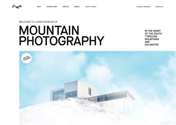
Image Credit: https://www.lumenmuseum.it/
2. Déplacé Maison
Déplacé Maison is an independent trekking shoes and accessories brand. Their website represents the spirit of the brand and offers visitors collections’ creative lookbooks. Also, Déplacé Maison‘s website uses one of the latest web design trends – mixing illustrations with photos, which gives a new unique style to the clothing store’s website.
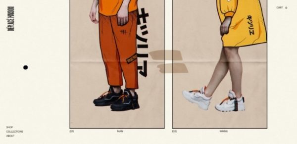
Image Credit: https://www.deplacemaison.com/
3. Pixetic Design Agency
According to Pixetic, they “believe in simplicity fused with a vivid appearance and a modern digital experience.” And this is exactly how their website design can be described: the minimalism combined with pop-out 3D visuals in vivid colors. This tandem works just right, giving the website visitors enhanced experience. Also, for more inspiration, you can check out their work examples to see the step-by-step design creation process.
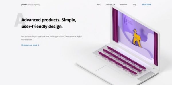
Image Credit: https://pixetic.com/
4. DN Fashion
DN fashion is an Italian brand with exclusive Italian shoes and bags that can be personalized just to the customer’s taste. The brand has a visually stunning website made in black and white that uses stylish dark mode design. The personalization feature is a great function that gives users more options and embraces the philosophy of Italian craftsmanship that the brand believes in.
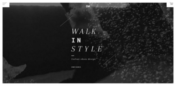
Image Credit: https://www.dnfashion.it/
5. GINGKO
Karine Goxes is a landscape designer who creates beautiful and autonomous gardens. Her website is filled with illustrations that give you a sense of nature and spring mood. This one is an excellent example of a great portfolio website design when you want to present your work experience in the most creative way.
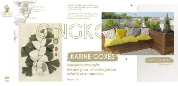
Image Credit: https://www.gingko.pro/
6. Papas Nativas
Papas Nativas is a multimedia story about exploring Peru’s culture and flavors. It might be one of the best websites that demonstrates how to create a memorable website for a restaurant. It has everything: from great visuals with mouth-watering photos of Peruvian meals to personal stories about their origin.
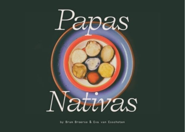
Image Credit: https://www.awwwards.com/sites/papas-nativas
7. Not a Single Origin
Not a single origin is a project that tells the story of Sydney’s population through chocolates. Sounds fascinating enough? Their website is truly astonishing as well. With the vivid popping colors and minimalistic design, it represents well the concept – a mixture of different ethnicities within one city.
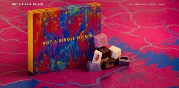
Image Credit: https://notasingleorigin.com/
8. Tall, True & Tangled
Tall, True & Tangled is a storytelling platform for people who love to explore the world. Its website is a great example of using interactive navigation for better user experience. The animated path is guiding you throughout the website, from the beginning to the end, which gives you the feeling of a real adventure.
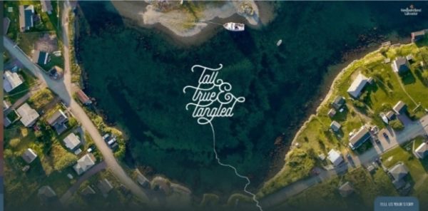
Image Credit: https://talltrueandtangled.com/
9. Happy Egg
Happy Egg is a company that produces and sells organic eggs. Their website offers a colorful platform to discover what the company is all about in a fun way. For a more interactive user experience, there’s a map of hens’ home, where you can see the conditions in which they live (the place looks like a 5-star resort complex for birds by the way.) So, this is another great use of visual decisions and emotional design to inspire you.
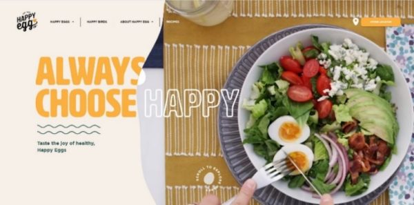
Image Credit: https://happyegg.com/
10. Davenport Blazers
As mentioned before, dark mode is currently one of the most popular website design trends. More and more websites are designed in dark colors as besides looking stylish, they’re also better for the internet user’s eyes and their device’s battery. The Davenport Blazers website is a great example on how to use dark mode in style.
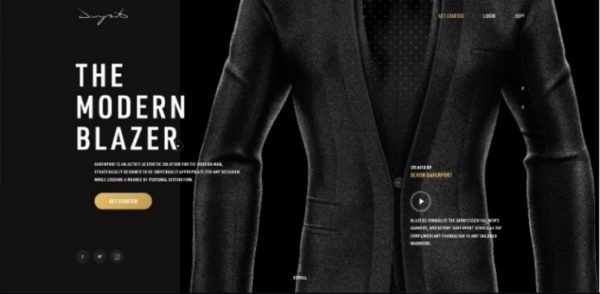
Image Credit: https://davenportm2m.com/
11. L’occitaine: Seeds of Dreams
Seeds of Dreams is an L’occitaine’s project to celebrate Provence’s biodiversity. What this website offers is a tamagotchi-like mini-game where you have to grow plants, water them, bring them sun and, of course, give them lots of love. Emotional design, when you make your website visitors feel something, is a great website design idea as it’s the best way to make people more attached to your brand.
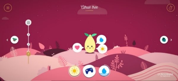
Image Credit: https://gb.loccitane-seeds-of-dreams.com/en/
12. Your Dream Ring
Your Dream Ring allows its customers to shop for an engagement ring that is custom made. The future ring is drawn in gouache which is an artistic technique that’s been used for centuries to create high-quality jewelry. Your Dream Ring website is a great example of how you can use videos to represent your brand’s concept and how you can make a great platform for people to create a custom version of your product. 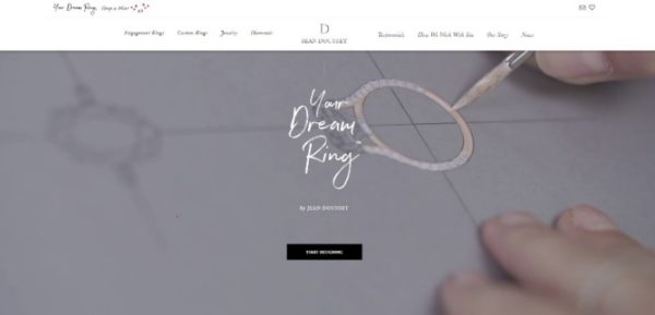
Image Credit: https://yourdreamring.jeandousset.com/
13. Tommy X Lewis
Lewis Hamilton, race car world champion, partnered with Tommy Hilfiger‘s for the new season. The website for this collaboration offers a minimalistic design with hand-drawn illustrations. Also, it includes great interaction features for users to discover additional content and get a more engaging experience.
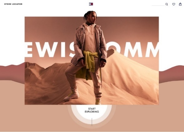
Image Credit: https://www.awwwards.com/sites/tommy-x-lewis-explore
14. Okains Bay Longline Fishing
Okains Bay website takes minimalism even further by letting their customers discover info about their sustainable and ethical fishing company through the range of visuals. There’s a minimum amount of text on the website but still, its immersive storytelling potential brings its visitor a truly memorable experience.
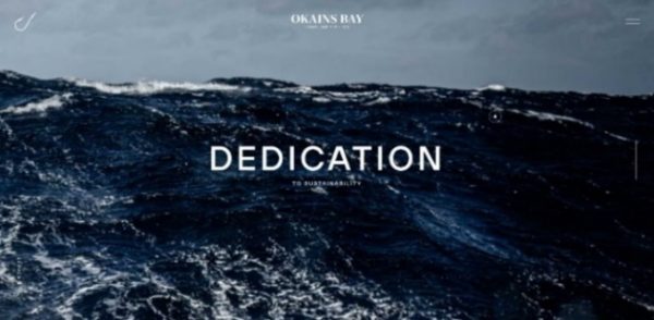
Image Credit: https://www.okainsbayseafood.co.nz/
15. Campesino Rum
The Campesino Rum website is another great example of visual storytelling. It will take you through the mysterious Panamanian jungle to eventually discover what drink will suit your spirit the best. Here you can see again that personalization and great visualization of a story is one of the best ways to promote your brand and the idea behind it.
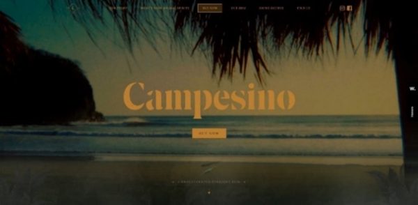
Image Credit: https://campesinorum.com/
16. Gucci 1955 Horsebit Bag
The Gucci 1955 Horsebit online catalogue website presents the brand’s new handbag collection with some stunning 3D visuals. Gucci itself tends to present their collections most creatively; just take a look at the Gucci Zumi website. Gucci 1955 Horsebit offers its visitors the 360-degree look the collection, making the shopping process even more enjoyable.
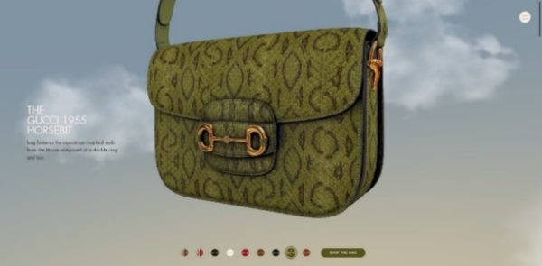
Image Credit: https://1955horsebit.gucci.com/#/handbags
17. Cycles Cavale
Cycles Cavale is a French bicycle brand based in Paris. Their website design – simple but at the same time interactive – delivers all the essential information about the company in an extremely engaging way. More to that, a smartly built navigation turns user’s visit into a little adventure.
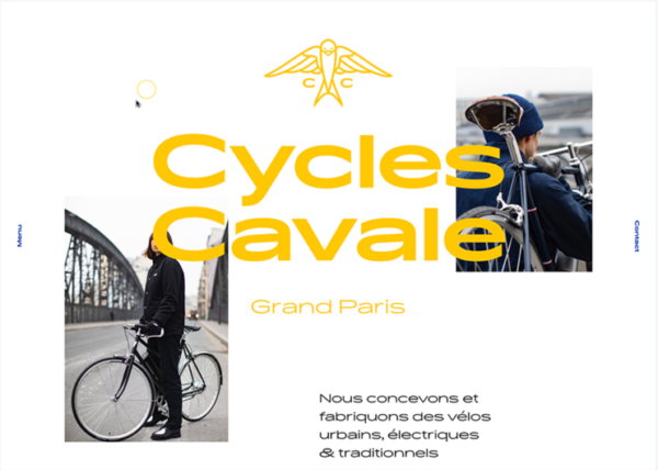
Image Credit: https://www.awwwards.com/sites/cycles-cavale
18. RED Company
RED Company is a Dutch real estate development company with a remarkable website. They shifted the focus towards visuals like photos, making them of large size but, also, of the highest quality. This is a great website design idea to present your company in a simple, yet impressive way to attract potential clients or investors.
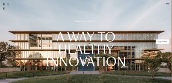
Image Credit: https://www.red-company.nl/
19. The Fragrance Conservatory
The Fragrance Conservatory is a source of credible information about fragrance and its ingredients. Their colorful website offers a great database for the fragrance universe and a great user-friendly interface to explore it through. The website navigation is also done in an extremely creative way as it is made in the form of the actual conservatory where instead of the rooms there are website pages.
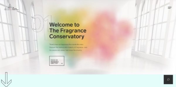
Image Credit: https://fragranceconservatory.com/
20. Pasticceria Adami
Pasticceria Adami is a small Italian artisan cake shop. Its website welcomes you with a Proust quote and then leads you through the Pasticceria Adami’s philosophy by using videos, minimum of words and nothing more. This is a great website design idea as when it comes to the food, visual representation can speak better than words.
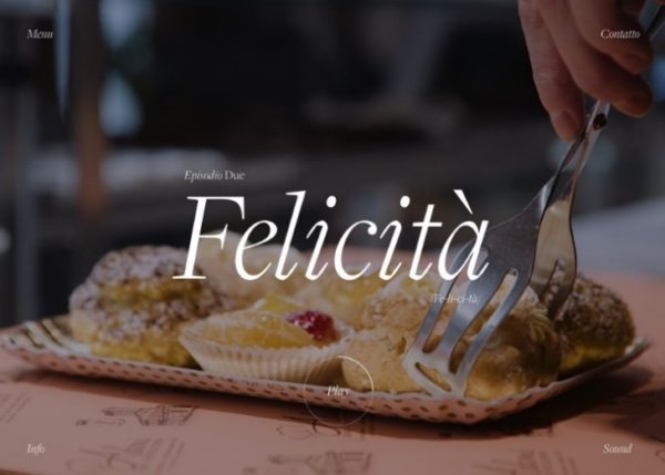
Image Credit: https://www.awwwards.com/sites/pasticceria-adami
Coming up with stunning website design ideas can be easier than you think. The perfect plan is to carefully consider its future visitors and try to create the most memorable experience for them. The examples of the best websites provided above can serve you as a great source of web design inspiration as they show how you can use your visual content to represent your brand concept in the best way. So, use them for that and may the creativity be with you.
