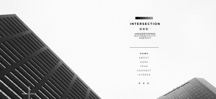
If you’re a design or fashion enthusiast and follow trends in these industries, you’ve probably come across the term ‘minimalism’ at some point. Indeed, the popularity of this concept has grown tremendously in the past few years and now, it can be seen being thrown around pretty much everywhere to define lifestyle, architecture, artwork, and even web design.
So, what is minimalism?
Put simply, minimalism entails focusing on the core purpose of something while reducing any excessive features that play little or no central role in the attainment of this purpose. In web design, minimalism is achieved by getting rid of most aesthetics and unimportant web features that steal away the attention of the user from the core business of a website. This entails eliminating any fancy fonts and unnecessary images, using the fewest possible number of colors, and creating high-level content that communicates your message as succinctly as possible.
Top 5 key elements of minimalist web design
While there’s no particular rule on how you can achieve minimalism with your web design, implementing the following five elements will get you closer to your goal.
Content
When it comes to minimalism, the goal is to achieve more with less. This means removing any distractions in the way of the web user and prioritizing all essential components. A good place to start this process is to analyze your content and identify what sells your business as well as what might be distracting the attention of your visitors. You can also learn from award-winning websites produced by the world’s top web design companies.
For example, you need to get rid of all generic content that adds little or no tangible value to your business site. Cut down any long-winded sentences and paragraphs by removing unnecessary details and phrases in your copy.
Additionally, avoid giving your readers too many options to choose from as this may interfere with their decision making.
Finally, be sure to place your most important content at the top of your web pages. Remember, visitors are likely to stay or leave on your site based on the impression you create in the first few minutes of landing and browsing your site.
Images
Let’s face it, humans are visual beings and respond quite quickly to what they see as compared to all other senses like hearing, touch, or taste. It is for this reason that the use of images is encouraged in web design and pretty much elsewhere where attention is needed.
However, overuse or misuse of images can be detrimental to user experience in the sense that it can end up drawing away user attention or even make your site heavy and slow to load. To overcome the latter issue, visit Hosting Foundry to learn how a good web host can help.
If you’re striving for minimalist web design, it’s vital that you’re extremely picky when selecting your images. To begin with, keep off from using irrelevant stock images that add no real value to the other content on your site. While at it, choose images that are bright and large enough to create that all-important emotional connection that your readers yearn for. More importantly, ensure that the images or illustrations you choose do not come crowded with too many details.
Color
The color scheme you choose for your design matters a lot when it comes to keeping or chasing away your visitors. If you’re looking to keep your web design simple, try to limit your choices to just a few colors, ideally one or two. To get the most out of your selected color palettes and for maximum visibility, use high contrast colors that offer great visual performance and also ensures that your most important content is pushed to the foreground.
Typography
Like color, your choice of font matters a great deal in web design and the reason you have to treat it with a lot of care if aiming for a minimalist design. Choose clean and easy-to-read typography to create visually appealing texts. And if you have to mix several fonts, then be sure to choose those from the same or closely related font families. Finally, your selected fonts need to be legible and shouldn’t strain the readers’ eyes.
Navigation
To help users and search engines access the various parts of your site, it’s important for you to ensure that your site’s navigation is spot on. This means placing navigation buttons and links where users can easily see them and highlighting links to attract attention and clicks.
Have your main menu at the topmost part of your design and other less important pages and links in your footer area. While at it, keep both the header and footer areas clean by removing rarely used elements and unimportant content.
What are some of the features and elements you avoid to keep your web design minimalist? We’d love to hear your feedback.


