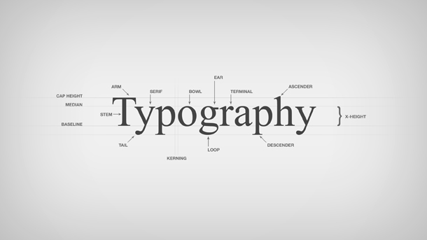
Typography isn’t nearly as hard as it seems. If you’ve ever seen beautiful typography and desperately wondered why you’re unable to duplicate it, you’d be shocked to learn how simple the formula actually is. There’s a lot less creativity involved in beautiful typography than you might assume. There’s just a few rules of thumb to follow, and everything else is smooth sailing from there. Master the basics, and save the creativity for later.
Choosing the Perfect Font (or Fonts)
Don’t look through the preset fonts on your PC. Professional typographers hardly use them. They’re best reserved for typed letters or college papers. You can purchase better fonts from creators who are selling them, or even download some for free depending on their licensing. Whatever you do, avoid overly decorated fonts or childish fonts that will be difficult to read. It’s okay to choose a font with a little embellishment for larger titles, but the embellishment should absolutely never affect the legibility.
Selecting a Font Size
Big fonts are obnoxious, and small fonts are impossible to read without squinting. Surely, there has to be some middle ground. Larger fonts should be reserved for major titles or headings. Medium fonts work for subheadings or takeaway information. Smaller fonts work best for body text. But large, medium, and small are all relative terms. Different fonts take up varying amounts of space, known as points. A dozen points make a pica, which is the standard size for most body text. If you’re blending typefaces, just make sure there isn’t a severe disparity between your small, medium, and large sizes.
Finding the Ideal Line Length
Every line should be between 45 and 90 characters. You may have to set custom margins in order to achieve this. Larger fonts won’t likely accommodate 90 characters per line, so you may have to find that maximum on your own. If you want to avoid hyphenating words, you’ll have to manually set the distance between characters to fit every word within that character limit on a single line. This is called adjusting the tracking, and it’s an excellent way to get a smooth flow without having to rewrite content to work with the line length.
Spacing Your Lines Correctly
Spacing makes a huge difference in terms of readability. If your spacing is wrong, your lines will appear to be jammed together and difficult to read, or far apart with tons of wasted space in between. Your spacing will depend on the font you choose and the point size you’ve selected, but a good general rule is to try to stick between 120% and 145% of the font size for line spacing. If you’re unsure about the exact spacing you should be using for your selections, play around in increments of five percent until you find the sweet spot.
Body Text is Key
You’ll always have more body text than anything else. Even if there isn’t a whole lot of body text, it’s still going to outnumber any other text on the project you’re working on. This means that getting the body text exactly right should be your primary area of concern. That’s the foundation from which you’re building, and you can’t afford to neglect it. Don’t get ahead of yourself. Make all of your decisions based on the final selections you’ve made in this area.
Everything else, like color and the integration of graphics, is an entirely separate process that relates more to design. If you have a keen eye for design, this is where you get to put your art skills to work. As long as you’re following the right formula for typography, any other choices you make will naturally fall in line.
About the author:
Mary Frenson is a Marketing Assistant at Checkdirector.co.uk, a new source of information on UK companies. Mary is always happy to share her marketing ideas and thoughts on business issues. In her free time she enjoys handicrafts.


