The visual weight of a design, in a design composition, refers to how good it attracts its viewers’ attention as compared to the compositions’ other components. If your object is “heavier” it will be more eye- grabbing.
Make it prominent by using different colour:
If the colour contrast between surrounding and an object is high, it is more able to gain attention.
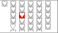
In the above example, notice how the size, margins and shape of square hearts are identical; the red square-heart gets your attention quickly due to its distinctive colour as compared to other elements in the composition.
Move the object away from others:
One effective tip to increase the visual weight of an object is to put your object at some distance from other objects in the composition. By adding plenty of negative space around the object you can separate it from other objects which will also make your object stand out.
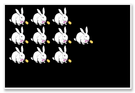
In the above example, our eyes interpret the composition as two groups of rabbits, a big group of 9 rabbits and a small group of 1 rabbit.
By giving it a different look:
It’s hard for us to differentiate the same things. You can make the visual weight of an object heavier by giving it a different look as compared to other objects
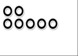
A slight change in the style properties of an object heavily influences its visual weight if objects in the composition look similar. In the above example, you can see that the circle filled with black color gets our eye’s attention quickly as compared to other circles in the composition.
Make your object prominent by pointing it:
A simple tip for increasing the visual weight of your object is to attract the viewer’s attention to it by using different visual cues such as arrows.
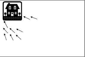
In the above example, you can see how the visual weight of the house is increased because of the arrows in its surrounding pointing to its location. It doesn’t matter where your attention goes; you redirect to look at the house because of the arrows.
By making it visually complex:
A complex object attracts our eyes when it’s set between unadorned and simple objects. You can make an object complex by adding texture, changing its shape, drop shadows, adding different colors to it and so on.
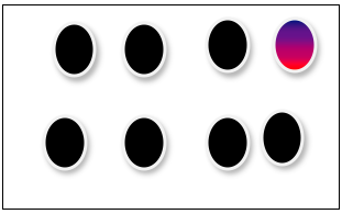
The multi coloured circle in the above example has the heaviest visual weight because the objects in its surroundings are styled plainly.
Make it large:
Making an object bigger than the other objects around will also increase its visual weight. A reasonable proposition is: if an object has more visual space it is more visible to viewers.
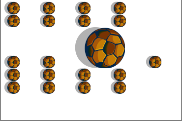
In the above example, you can easily notice that how your eyes are quickly drawn to the large ball because of its different size.
So you have seen that visual weight has the great importance and an extremely powerful design tool for tactically arranging elements.
Author Bio:
Ashley Alex is a creative emerging graphic designer who understand the impects and importance of design. She is also a freelance works with Assignment Writing Service at DoneAssignment.co.uk She has written many blogs to help thousands of studentslearing technology and designing. For more, follow her on Twitter|Facebook.


1 Comment
Joan Diaz
17 December, 2014very interesting