

Peculiar Way to Advertise Fonts via Typography-Perception & Persuasion
If you’re a web designer, you must be well equipped with the fact that typography is not only about putting the text in your web content but it goes hand-in-hand with your web design.
In the recent times, typography has been recognized in a broader spectrum and so, the importance of typography has been widely recognized in content marketing!
If you’re looking forward to the success of a marketing campaign, trust me, the typography of your web design, promo posts, and ad copies must be paid extra focus to.
Why? Because advertising and marketing are all about playing tricks with the eyes and mind of the audience. And typography does that for you!
Typography is something that can influence the user experience (UX) of your audience. The better UX you provide to your visitors, the better results you can achieve!
In the behemoth digital market of today, you have a profusion of audience available on the other end. And what are your advertising channels? Your website, social networking channels, and the content related to these.
For better communication with the audience, you require a better web design to appropriately express what you want to say with the ad copy. So, say it with your best fonts and typography designs.
Typography for Content Marketing
When it comes to content marketing, you need to convince your audience. That simply means targeting the audience with a sentimental or practical appeal.
Both these appeals can be efficiently made by a better way to express what you want to say.
What typography does to your audience is that it pulls them into your message. If it fails to do so, that is a sign that you need to work on typography.
The first thing to do here that goes well along with content marketing too, is to know your audience right. Learn about what might influence your audience and how you can write a message that it is able to get their attention.
Also, be sure of leaving a positive mark on your audience’s minds. Never go for anything that attracts them in a negative way. It can be a bad typography, a bad font, bad alignment, too much clutter or anything else that can be an eye soar to your audience.
So how can you save yourself from leaving a negative impact on your audience with your typography? Read on so you can relate the basics of typography with efficient advertising skills:
Improving the Legibility and Readability of Ads with Better Typography
Better typography can help enhance the readability and legibility of your web content and ad copies.
If your ad copy doesn’t attract as many leads as you had planned, you must reconsider your ad copy’s typography and the typefaces. Bad typography fails to catch the eyeballs of your readers and so, they choose not to stay on your webpage or ad.
Believe it or not, studies have shown that the poorly designed web content leaves a negative impact on the audience and they even end up physically frowning and feeling bad.
Your advertisements are the best way to catch the attention of your prospects and boost conversions through digital marketing. Creating the ad content with right placement, contrast, and color of your typography can leave a great impact on your audience’s mind.
For an improved typography of your ads and web pages, you must pay heed to the following typography factors:
- Color Contrast For The Ad Copy
Your ad copy content must be pleasing to the eye. That is how you persuade your customers. And for this, using the same color for both your text and background is never going to work. In fact, it will make it dull and unnoticeable.
With typography, you must play a little with colors. But then, not too much!
Studies have shown that different colors leave different impacts on the human mind. For instance, Pink color stimulates affection and friendliness, and soothes the eyes, while White color sends soothing sensations to the mind along with a feeling of energy and unity.
So, the color that suits your ad message and mindset of your audience can be used in your typography.
You can use different color contrast techniques for your ad typography, like light and dark color contrast, color temperatures, color hues, scale and size contrast, patterns contrast, color intensity, color textures, etc.
Adding your font with a color contrast adds to the visual appeal of your typography and thus makes your ads more appealing.
- Using Visual Hierarchy
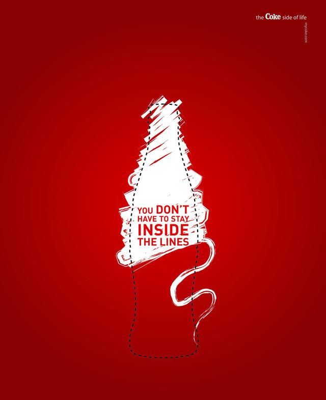
When it comes to online advertising, creating Visual Hierarchy with typography can really help you a lot!
Visuals can indeed play with the human brain. With visual hierarchy, you can tell your audience where to look at on your ad copy. It is the best way to highlight the whole point of your advertisement or web content. This allows you to control what your audience will read first, what they’ll read next, and so on.
So, with right type hierarchy, you can persuade your audience in a better way and make the point of your ad clear.
- Selection of Font Type And Size

Be very careful while choosing the font of your typography. Your font doesn’t only catch the eyes of your audience, but it also helps you create a brand identity.
For instance, one can recognize Disney because of the unique font that it uses and this is how typography font can help you build the brand identity for your brand.
Thus, while selecting your typography font, you must make sure that it goes with your brand, message, and theme.
Also, along with selecting the type of font, you must take care of its size. It mustn’t be too big or too little as in both cases, it might affect the readability and response from your audience.
Not only this, the selection of your typography font can boost or slow down the readability as well. For instance, a study by Google and IBM showed that the Georgia font had 7.9% faster readability as compared to the Helvetica font.
To conclude, it can be said that with a keen attention towards these factors, you can create an ad copy just the way your audience would like. This way, you can win conversions with the right typography design. It is all about playing with the human brains, and you just need to influence them!
Author Bio:
Vin Boris is a Social Media Marketer & Content Writer at SoftProdigy, a web design and development company. SoftProdigy has been outshining in the IT industry for more than 10 years. The experts at SoftProdigy have worked for numerous clients including both small and high-end brands.
Related Posts

The Power of a Strong Online Presence in Pharmaceutical Job Applications →

Search Engine Optimization and SEO Analytics for Houston Businesses →

The Ultimate Guide To Using Images For Marketing →


